
Farmhouse Wall Decor












Farmhouse Wall Decor and Wall Art
Farmhouse wall decor uses subjects with a working past, weathered barns, wheat fields, windmills and rustic still life, held in a warm neutral palette of cream, oatmeal and soft black. It suits kitchens, living rooms and dining rooms, and it reads best when pieces look collected over time rather than bought as a matching set. This collection gathers agricultural landscapes, harvest scenes and ordinary botanicals across every size, from a single piece for a kitchen gap to an extra large canvas for a living room wall.
Is Farmhouse Decor Still In Style?
Yes, though it has changed shape. Searches for farmhouse decor are down roughly a third year on year, and what has fallen away is the literal version: shiplap on every wall, distressed signs with words on them, and matching sets bought together. What has lasted is the underlying idea, which is warm neutrals, natural texture and subjects drawn from working rural life.
The style people are moving towards is usually called modern farmhouse or organic modern. It keeps the warm palette and the natural materials but drops the ornament. In practice that means fewer pieces, larger sizes, cleaner subjects and no word art. A single large wheat field photograph reads as current. Three small distressed signs read as 2018.
If you are furnishing now, buy for the durable half of the style rather than the decorative half. Landscape, botanical and still life subjects in muted tones will still look right when the trend cycle moves again.
Modern Farmhouse Wall Decor Versus Traditional
Modern farmhouse wall art is the version most people are shopping for now. Traditional farmhouse leans warm and busy: aged wood tones, sepia and cream, ornate frames, and more pieces on the wall. Modern farmhouse leans cooler and sparser: soft black and white, clean edges, one large piece instead of a group, and unframed canvas rather than an ornate moulding.
Most homes now sit between the two. A reliable middle is a warm neutral photograph at a generous size, hung unframed, in a room where the texture comes from the furniture and the walls rather than from the art.
The Subjects That Read As Farmhouse
Agricultural landscape is the safest ground. Wheat fields, hay bales, tractors at work and farmland running to a horizon carry the warm neutral palette without any effort and hold up at any size.
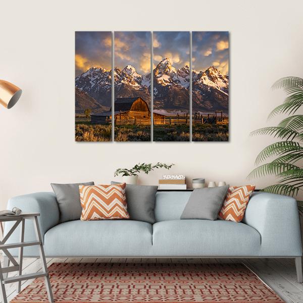
Rustic wall art of barns and outbuildings is the most literal option and the most rewarding when the photography is good. Weathered timber under an overcast sky reads far warmer than the same barn under postcard blue.
Windmills bring a strong graphic shape, which makes them useful on a wall that needs a focal point rather than a wash of colour.
Rustic still life is the underused category: a jug, a board of vegetables, bread and preserves on scrubbed wood. It suits a kitchen or dining room, works at a smaller size, and reads as considered rather than themed.
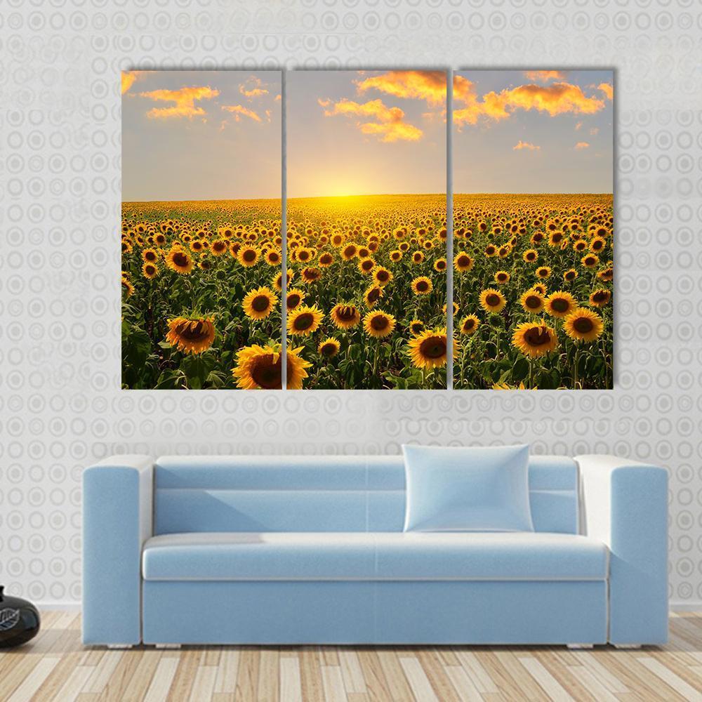
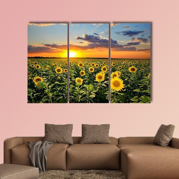
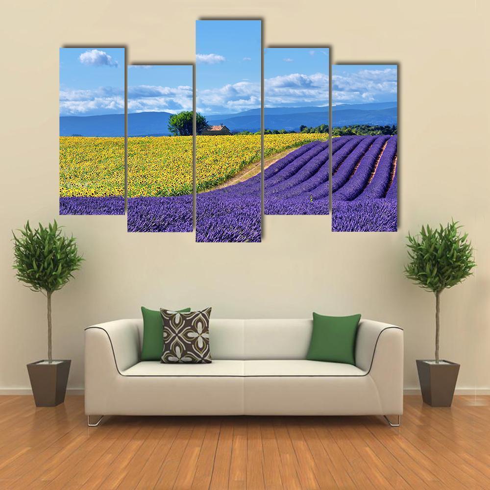
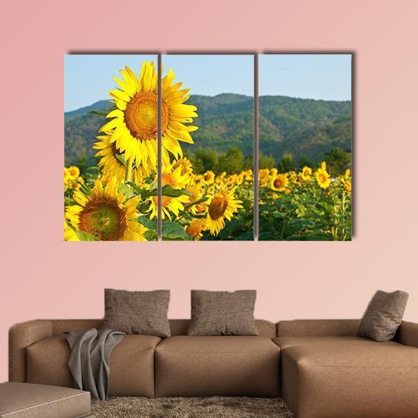
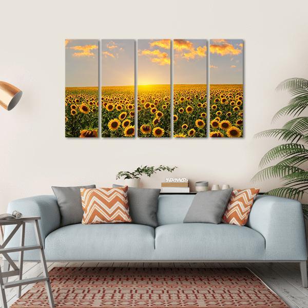
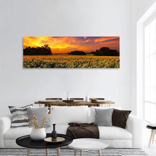
Ordinary botanicals belong here too. Sunflowers, lavender fields, chamomile and cotton. The plant should be familiar and the treatment restrained. An exotic bloom in saturated colour pulls the room somewhere else.
Colour And Tone: Warm Neutrals
Most farmhouse schemes have their neutrals settled by the furniture before any art arrives, so the artwork has one job: add warmth without starting a new colour story.
Two palettes run through farmhouse art and they behave differently. The quiet one is cream, oatmeal, weathered brown and soft black, which is what barn, wheat and harvest subjects give you. The bright one comes from the field crops: a lavender field is purple and green, a sunflower field is yellow and blue. Both are honestly farmhouse, but the second is a colour decision rather than a neutral one, so place it in a room that can carry it.
Warm neutral against a warm neutral wall is the quietest option and the hardest to get wrong, though it relies on the artwork having enough internal contrast not to disappear. Check the darkest part of an image before committing to it on a pale wall.
What to avoid is easier to state: three or more saturated colours at equal weight, and cool greys with no warmth in them, however rustic the subject happens to be.
What Is The Two Thirds Rule For Wall Art?
The two thirds rule says a piece of wall art should span roughly two thirds to three quarters of the width of the furniture beneath it. Above a 72 inch sofa that means a canvas between 48 and 54 inches wide. Over a 48 inch sideboard, 30 to 36 inches.
It exists because art hung too small looks like a placeholder, and that is the single most common mistake in this style. Farmhouse rooms already carry visual texture from beams, panelling and open shelving, and a modest piece disappears into it.
Height follows a second rule: centre the artwork at 57 to 60 inches from the floor, which is average eye level. When it hangs above furniture, leave 6 to 10 inches between the top of the furniture and the bottom of the piece so the two read as one group rather than two unrelated objects.
Sizes, Large Pieces And Multi-Panel Sets
Large and extra large pieces suit farmhouse living rooms particularly well, because the walls tend to be broad and the furniture low. If you are choosing between two sizes, take the larger one. An oversized piece looks deliberate; an undersized one looks unfinished.
Many pieces here offer multi-panel layouts, though not all do, so check the options on the piece you are looking at. A 3 Horizontal set divides one image across three panels, so it stays a single subject with rhythm rather than becoming three separate works. Wide landscapes with a horizon running through them split well. A barn sitting square in the centre of the frame does not, because the gap lands through the subject. The 5 Star and 5 Pop layouts stagger panel heights and add movement, which suits a livelier room.
Choosing Farmhouse Wall Decor By Room
Living room. The largest piece in the house belongs above the sofa, and this is the room most people are shopping for. A landscape suits a horizontal wall better than an upright subject.
Kitchen. Farmhouse kitchen wall decor is the most natural home for this style and the one with the tightest constraints. Keep art clear of the hob and the sink, and choose smaller pieces, since you view them from three or four feet rather than across a room. Produce, still life and botanical subjects all suit.
Dining room. One larger piece on the wall people face while seated. They look at it for the length of a meal, so it can carry more detail than a hallway piece.
Bedroom. Quieter than anywhere else. Soft botanicals or a low contrast landscape, and nothing with a hard focal point directly above the pillows.
Entryway and hallway. Seen in passing and at close range, so one strong piece near the door does more than several small ones along a corridor.
Common Mistakes In Farmhouse Decor
Most farmhouse decor ideas fail for one of five reasons.
Buying a matching set of three. The fastest way to make a room look ordered from one page. Real farmhouses accumulated their contents across decades.
Hanging too small. See the two thirds rule above. This is the most common error and the hardest to judge from a product photograph.
Too much word art. Signage in quantity turns a room into a theme, and it is the element most associated with the dated version of the style.
Cool greys with no warmth. They read contemporary rather than farmhouse, whatever the subject is.
Matching the art to the sofa exactly. A near miss is more interesting than a match, which reads as a furniture accessory.
Making It Look Collected, Not Staged
Mix ages, so a vintage farmhouse subject sits beside a contemporary photograph rather than pairing two of either. Vary size deliberately, because a large piece with a much smaller one reads as a relationship while two mediums read as an accident. And let one element be plain: if the artwork is busy, keep the wall and the frame quiet.
The practical version is to buy one piece properly, at full size, and live with it for a few weeks before adding anything. Most rooms need fewer pieces than the first impulse suggests.
Pairings And Nearby Styles
Farmhouse overlaps with several other looks in this store. Rustic wall decor shares the weathered timber and worn surfaces. Vintage wall art supplies the older half of a mixed pairing. Still life wall art covers the kitchen and dining subjects in more depth.
For the botanical side, flowers wall art holds the sunflowers and lavender, and black and white wall art works when a farmhouse kitchen leans modern.
How Each Farmhouse Canvas Is Made
Every piece is printed to order on museum-quality canvas using archival inks that resist fading, then stretched over a solid wooden inner frame and finished ready to hang. Nothing is held in stock, so the piece you order is made for you.
An unframed gallery wrap suits farmhouse particularly well. There is no glass to reflect a window, the edge is soft rather than sharp, and it sits close to the wall, which matters in a room with panelling or a low ceiling. Framed options are available on most pieces where you want a defined edge, which helps when a pale artwork hangs on a pale wall.
Shipping is free within the US, and returns are free for 30 days in the US, UK, Australia and Canada.
Common Questions
Is farmhouse decor still in style?
Yes, in its modern form. Search interest is down about a third year on year, and what has faded is the literal version: shiplap everywhere, distressed word signs, and matching sets. The warm neutral palette, natural texture and rural subjects have lasted. Buy fewer pieces at larger sizes in muted tones and the room will still read as current.
What is replacing farmhouse decor?
Modern farmhouse and organic modern, which keep the warm neutrals and natural materials but drop the ornament. In wall art terms that means one large clean piece instead of a group of small decorated ones, unframed canvas instead of ornate mouldings, and landscape or botanical subjects instead of word art.
What size should farmhouse wall art be?
Follow the two thirds rule: the piece should span two thirds to three quarters of the furniture below it. That is 48 to 54 inches wide above a 72 inch sofa, or 30 to 36 inches over a sideboard. Centre it at 57 to 60 inches from the floor and leave 6 to 10 inches above the furniture. Kitchens are the exception, where you view from close range and smaller pieces work.
What are common mistakes in farmhouse decor?
Buying a matching set of three, hanging pieces too small, using too much word art, choosing cool greys with no warmth in them, and matching the art exactly to the sofa. The first two account for most rooms that feel staged or unfinished.
Should farmhouse canvas art be framed?
An unframed gallery wrap suits the style well, with no glass to reflect a window and a profile that sits close to the wall. Add a frame when a pale artwork hangs on a pale wall and needs a defined edge, or in a hallway or kitchen where the outer edges take knocks in passing.