







MONDAY SALE! • EXTRA 10% OFF + FREE SHIPPING DEAL | CODE: MONDAY10
MONDAY SALE! • EXTRA 10% OFF + FREE SHIPPING DEAL | CODE: MONDAY10
The Tiaracle Color Guide
Color is the fastest way to match art to a room that is already decorated. Start with a family below, open the color you want, and use the pairings further down when a room needs two colors rather than one. Every piece is printed to order on museum quality canvas and ships ready to hang.
Warm color advances toward the eye and cool color recedes. That one rule decides how a room reads before any subject is chosen, and it is the quickest way to narrow a whole catalogue down to a shortlist.
Neutral
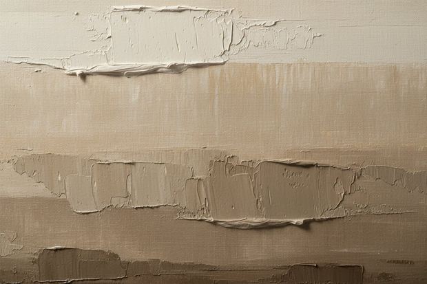
Neutral art carries a wall without arguing with anything else in the room. Black, white, gray, beige and soft undyed tones go with everything. This is the safe choice when a sofa, a rug or a kitchen already owns the color in the room.
Photography by Color
A photograph can be graded several ways and each one hangs differently. Black and white keeps the subject and drops the color. Full color keeps both. Loose watercolor softens the edges. Pick the grade first and the subject second.
Each collection is one color across its full range, from the palest tint to the deepest shade. The ladder on every card is the artist's vocabulary for that range, so a room asking for sage and a room asking for pine both start at green.
 Neutral
 Metallic
 Photographic
Two colors either sit opposite each other on the wheel, which gives contrast, or next to each other, which gives calm. Both are useful. The trouble starts when two colors are close but not close enough, and the wall reads as a mistake rather than a choice.

Opposite
Straight across the wheel, which is why dusk over water reads as strongly as it does. It is the most common pair in photography and the one this catalogue holds the most of.

Warm on Dark
The city at night, gold lit architecture and gold calligraphy on black. Black gives the eye somewhere to rest and gold gives it somewhere to go.

Neighbor
Blossom against new leaf, wildflowers through green stems, a pink sky over a green valley. Spring makes this pairing on its own, which is why it feels familiar rather than styled.

Neutral
Snow, frost, fog and monochrome city work, with no strong hue anywhere in the frame. Nothing in it can argue with the furniture, which is what makes it the safe choice.

Monochrome
One hue across every value, so contrast carries the image on its own. A photograph graded this way stays readable from across a room.

Every color decision on this page comes from two facts. Colors opposite each other on the wheel give contrast. Colors beside each other give harmony. Choose a segment to see both, then open that collection.
Red sits opposite turquoise, orange opposite blue, yellow opposite violet. Those three pairs carry almost every high contrast image in this catalogue.
Most rooms are decorated before the art arrives. Work from what is already in place, starting with the largest colored surface and moving down.
The Wall
The Furniture
The Mood
Light and low contrast art keeps a small room open, so white, gray and pale blue work harder than a dark field. If the wall itself is dark, a light toned print gives contrast and stops the piece disappearing into it. Size decides more than color does: keep the artwork to about two thirds of the width of the furniture below it.
Gray is neutral, so it takes almost anything. Deep blue and navy read as deliberate against it. Warm rust, ochre and terracotta stop a gray room feeling cold. Black and white art turns gray walls into a gallery. The one pairing to watch is another mid gray, which can leave the wall and the art looking like one flat surface.
Black and white art is called monochrome, meaning one hue carried across its full range of light and dark. In photography the same thing is called greyscale. Value does all the work in a monochrome piece, which is why it stays readable across a room where a busy color image does not.
Three pairs sit directly opposite each other: blue and orange, red and green, yellow and purple. Opposites give the highest contrast available, which is why they feel energetic. Blue and orange is the most common pair in photography, since it is what a sunset over water looks like.
Cool colors make a room feel bigger. Blue, green and purple visually recede, so a wall carrying cool art reads further away. Warm red, orange and yellow advance toward the eye and pull a large room in, which is what makes them useful in a room that feels empty or gets little direct sun.
Search the Catalogue
Tiaracle is all about bringing your interior vision to life. Search by subject, color or place, or have a custom design made for you.


