







Question 1
Should the art lead the room or join it?
If the room is finished, choose on the decor axis and the piece will settle in. If the wall is empty and the room needs a center, choose on movement instead and let the artwork set the tone.
THURSDAY SALE! • EXTRA 10% OFF + FREE SHIPPING DEAL | CODE: THURSDAY10
The Tiaracle Style Guide
Style is three questions, not one list. How a piece was made, how it looks, and which room it belongs in are separate things, and most stores mash them together. Answer them in that order and the shortlist gets short fast. Every piece is printed to order on museum quality canvas and ships ready to hang.
A style label can mean three different things at once. Watercolor is a material, Impressionism is a movement and Coastal is a room. Keeping them apart is the difference between a filter that works and a list that returns everything.
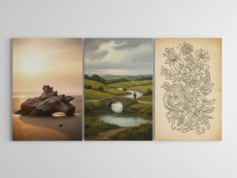
How It Was Made
A photograph, an oil painting and a line drawing hang differently even at the same size. Grain, brushwork and empty paper each carry light in their own way, which is why medium is the first thing to settle and the last thing most stores mention.
Browse by medium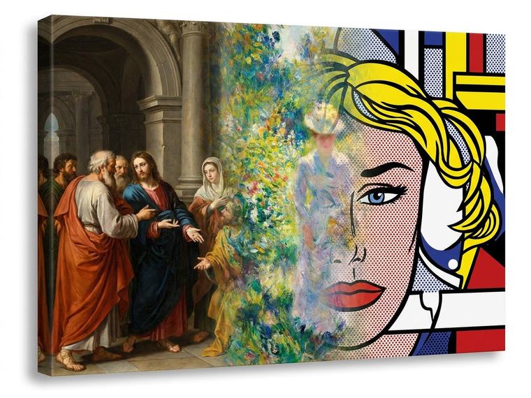
How It Looks
Impressionism, Art Deco and Pop Art are not moods, they are answers artists gave to specific problems. Knowing which one a piece belongs to tells you what it will do in a room better than any adjective.
Browse by movement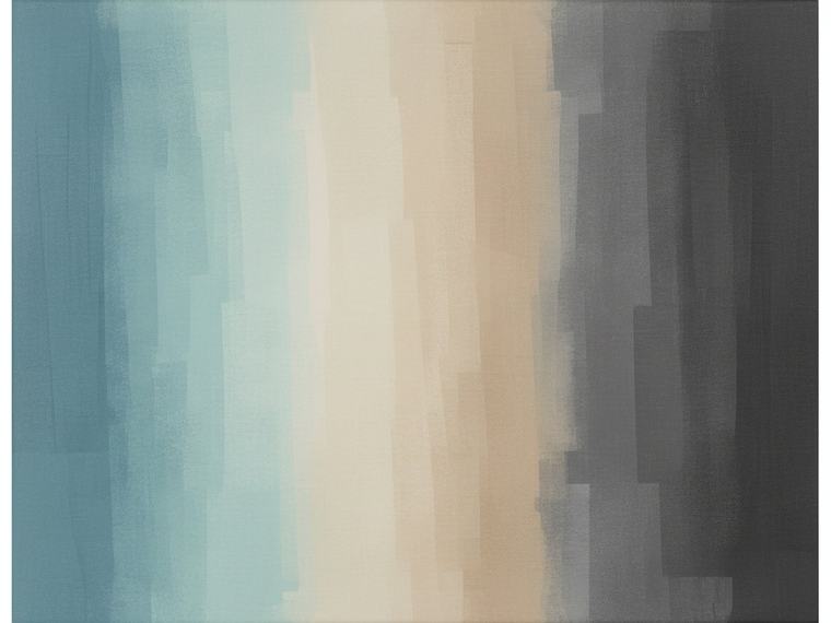
Where It Belongs
Coastal, Japandi and Industrial describe the space the piece is going into. This is the axis to use when the room is already finished and the art has to join it rather than lead it.
Browse by decor styleMedium is the surface, and the surface is what you see from two feet away. A photograph holds detail, an oil painting holds light in its ridges, a line drawing holds almost nothing on purpose. This is the axis that decides how a piece behaves up close.

Medium
The largest medium in this catalogue by a wide margin.

Medium
Color removed on purpose, so value and composition carry the frame.

Medium
Visible brush load and layered glaze. The most physical surface here.

Medium
Pigment carried by water, so edges bloom instead of stopping.

Medium
Flat, fast and saturated. Acrylic holds a hard edge where oil softens.

Medium
Graphite, charcoal and pen. The mark is the subject as much as the scene is.

Medium
One weight of line and nothing else. The most forgiving art in a busy room.

Medium
One shape against the light, with the detail removed. Reads from across a room.

Medium
Made on screen rather than on paper, which allows color no pigment can reach.

Medium
More than one material in one piece, so the surface changes as you cross it.

Medium
Assembled rather than drawn. Edges and overlaps are the whole language.

Medium
An image built from small units, so it resolves as you step back.

Medium
Letterforms as the artwork. Reads instantly, which is its strength and its risk.
Every style here was once an argument about what art should do. Impressionism chased light, Bauhaus chased function, Pop Art chased the supermarket. The names are worth knowing because each one predicts what the piece will do on a wall.

Style
No subject to recognise, so color, shape and gesture do all the work.

Movement · 1860 to 1970
The long break from realism. Modern is a period, not a synonym for new.

Movement · 1970 to now
Art being made now. The one label that keeps moving.

Movement · 1960s
Everything removed that the piece can survive without.

Style
Straight edges and repeating shape. Order you can see at a glance.

Style
Aged palette and period subject, from posters to botanical plates.

Movement · 1950s to 1980s
Deliberate nostalgia. Retro imitates a period, vintage belongs to one.

Movement · 1950s
Mass culture treated as a subject worth painting. Flat color, hard edge.

Movement · 1924
Real things in impossible arrangements, painted as if observed.

Movement · 1870s
Light recorded quickly, so the brushmark stays visible in the finished work.

Movement · 1920s
Symmetry, stepped form and metal tone. Machine-age glamour.
 Arriving
Movement · 1890s
The whiplash curve, taken from stems and hair rather than from geometry.
 Arriving
Movement · 1919
Primary color and pure shape, on the argument that function is the form.
 Arriving
Movement · 1907
One object shown from several angles at once, flattened onto one plane.

Movement · 1905
Feeling over accuracy. Color pushed past what the eye reported.
 Arriving
Movement · 1960s
Pattern engineered so the flat surface appears to move.

Movement · 1970s
Spray, stencil and letterform, brought indoors from the wall it started on.
 Arriving
Movement · 1960s
Saturated color and warped type, drawn from the poster art of the era.
 Arriving
Style
Made outside the academy, so pattern and story lead over perspective.
 Arriving
Movement · 1400 to 1600
Perspective, anatomy and light solved for the first time.

Movement · 1600 to 1750
Deep shadow against a single light source, staged for drama.

Movement · 1850s
Ordinary life recorded without idealising it.

Style
Invented worlds rendered as if they could be photographed.
Arriving
Also arriving in this axis: Art Nouveau, Bauhaus, Folk Art, Psychedelic, Renaissance, Cubism, Op Art. Each one becomes a collection as the catalogue is classified, and every piece that belongs in it is already in the store.
Movements did not arrive at random. Each one answered the one before it, and seeing them in order explains why Bauhaus looks nothing like Baroque. Choose any band to read what it was and what it does in a room.
Where to start
Impressionism made light the subject and gave us almost every landscape print sold today. Minimalism took everything away and gave us the calm, near empty pieces that suit a modern room. Most of what hangs in a house sits somewhere between those two positions.
Decor style describes the room rather than the artwork. Use this axis when the furniture, the paint and the floor are already decided and the art has to join them. It is the fastest route to a piece that looks like it was always there.

Decor Style
Sand, sea light and pale wood. Cool and low contrast.

Decor Style
Warm neutrals, weathered timber and open country.

Decor Style
Layered pattern, earthy color and nothing matching on purpose.

Decor Style
Rough texture and honest material. Older than farmhouse and less tidy.

Decor Style
Warm wood, tapered line and a restrained palette from the 1950s.

Decor Style
Light, plain and functional, built for long winters and short days.

Decor Style
Scandinavian restraint with Japanese proportion. Quiet and deliberate.
 Arriving
Decor Style
Beauty found in the worn and the imperfect rather than in the finished.

Decor Style
Space left empty on purpose, so what remains has room to be seen.

Decor Style
Classical subject and symmetry. The safe center of the range.
 Arriving
Decor Style
Traditional bones with modern restraint, the middle both sides can live with.

Decor Style
Brick, steel and machinery. Hard surfaces that want art with weight.

Decor Style
Library light, deep tone and old scholarship.

Decor Style
Gold, gloss and high contrast, used sparingly and on purpose.

Decor Style
More of everything, arranged so the abundance reads as intent.

Decor Style
Periods and origins mixed deliberately. Harder to do well than it looks.

Decor Style
Broad leaf, humid green and strong sun.

Decor Style
Whitewash, terracotta and hard noon light.

Decor Style
Desert clay, woven pattern and wide dry horizon.
 Arriving
Decor Style
Tilework geometry, arched form and saturated dye.

Decor Style
Rope, chart and hull. Coastal with a working boat in it.

Decor Style
Small-scale florals, garden light and domestic calm.
 Arriving
Decor Style
Painted furniture worn back on purpose, in chalky pastel.
Arriving
Also arriving in this axis: Wabi-Sabi, Moroccan, Shabby Chic, Transitional. Each one becomes a collection as the catalogue is classified, and every piece that belongs in it is already in the store.
Three questions that narrow the whole catalogue faster than scrolling does.
Question 1
If the room is finished, choose on the decor axis and the piece will settle in. If the wall is empty and the room needs a center, choose on movement instead and let the artwork set the tone.
Question 2
Pattern competes with pattern. A room with a rug, a print sofa and open shelving wants Line Art, Minimalist or Black and White. A plain room can carry Maximalist, Psychedelic or Pop Art.
Question 3
Warm oak, rattan and brass sit with Mid-Century Modern, Farmhouse and Folk Art. Steel, concrete and glass sit with Industrial, Bauhaus and Geometric.
Abstract is the most searched wall art style in the United States, ahead of modern, vintage and boho. It is popular because it carries a room without committing to a subject, which makes it the easiest style to live with when tastes in a household differ.
Modern art is a period, roughly 1860 to 1970, running from Impressionism through to Abstract Expressionism. Contemporary art means art being made now. Modern is fixed and contemporary moves, which is why a 1950s painting is modern and never contemporary.
Work from what the room already has. If the furniture, rug and paint are settled, choose on decor style so the artwork joins them. If the room is plain and needs a focal point, choose on movement and let the piece lead. Medium decides the surface texture and matters most at close range.
Wabi-sabi is a Japanese aesthetic that finds beauty in the worn, the asymmetric and the incomplete. In wall art it looks like muted earth tone, visible texture and a composition that leaves space empty rather than filling it. It sits close to Japandi and further from Glam than any other style here.
No. Vintage means the piece genuinely belongs to an earlier period, in subject and palette. Retro means a new piece made to imitate one. Both suit the same rooms, and the difference matters when you want the room to look collected rather than styled.
Search the Catalogue
Tiaracle is all about bringing your interior vision to life. Search by subject, color or place, or have a custom design made for you.