

THURSDAY SALE! • EXTRA 10% OFF + FREE SHIPPING DEAL | CODE: THURSDAY10
THURSDAY SALE! • EXTRA 10% OFF + FREE SHIPPING DEAL | CODE: THURSDAY10
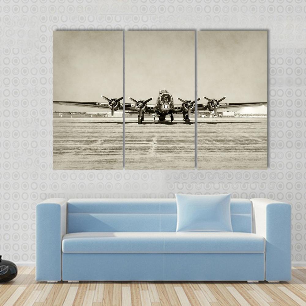
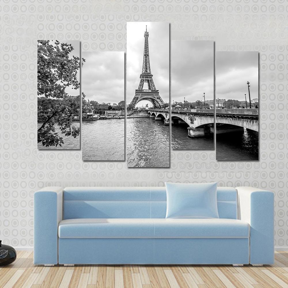
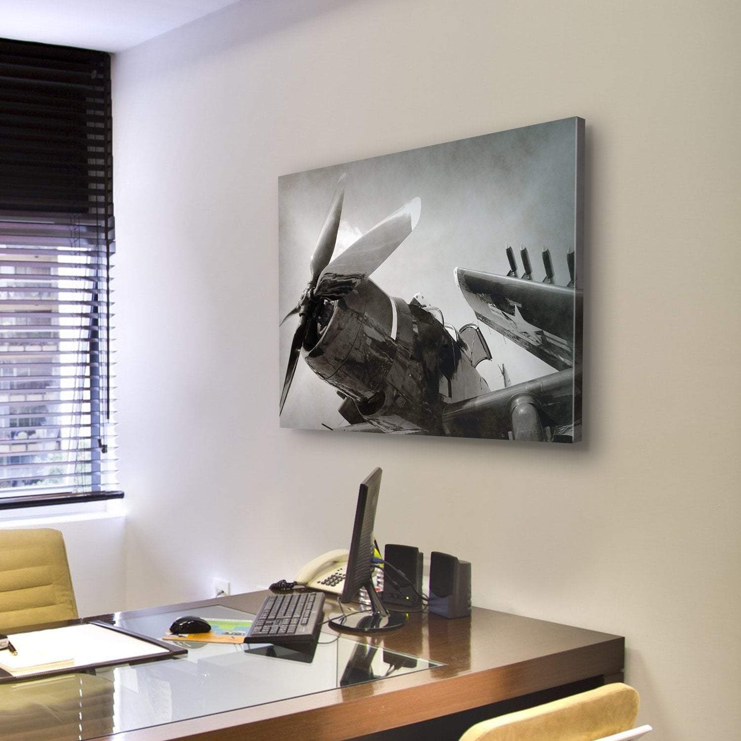
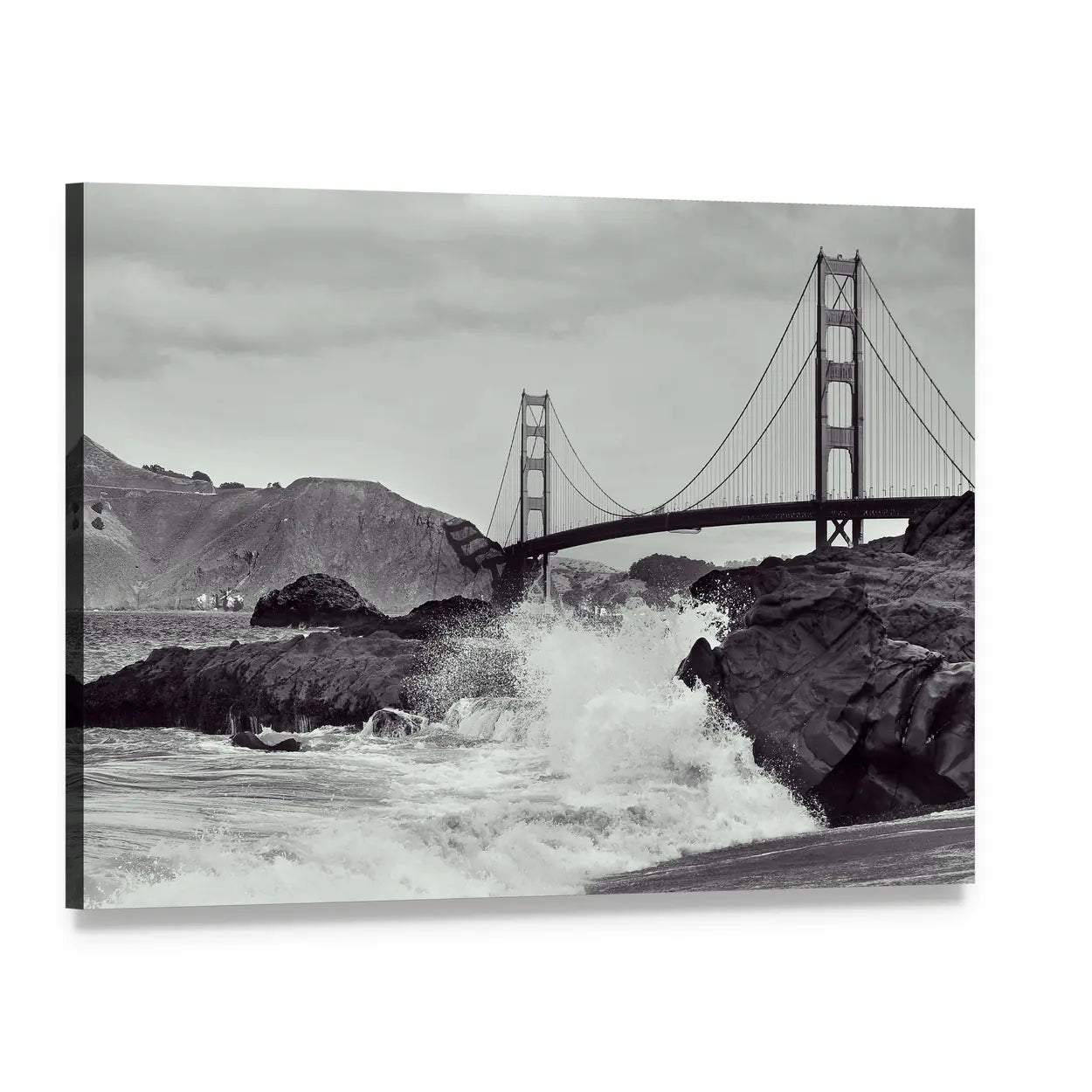
Black and white wall art is artwork with the color removed, so shape, light and contrast carry the whole image. It works in almost any room because it adds nothing to the palette already there. A monochrome photograph sits beside a navy sofa, a sage wall or an oak floor without competing with any of them. This collection is built from black and white photography, architecture, landscapes and minimalist abstracts, printed to order on museum-quality canvas with archival inks that resist fading. Every piece is stretched over a solid wooden inner frame and arrives ready to hang.
Black and white artwork removes the one variable that makes wall art hard to choose: hue. A colored print has to agree with the sofa, the rug and the wall. A monochrome print only has to agree with the light in the room. That is why it survives repainting, new furniture and a change of taste, and why it appears in almost every interior style from industrial lofts to Scandinavian rooms. If a room already has a strong color story, monochrome art is the safest thing to put on the wall.
The usual term is monochrome, which means one hue rendered across many values from black through grey to white. In photography it is called black and white or greyscale. Greyscale is the technically precise word: the image contains only lightness information and no color information at all. Related but different is duotone, where two inks are used, and sepia, where the greys are shifted warm brown. Most of the work here is true greyscale photography, with a smaller group of high-contrast graphic and minimalist pieces.
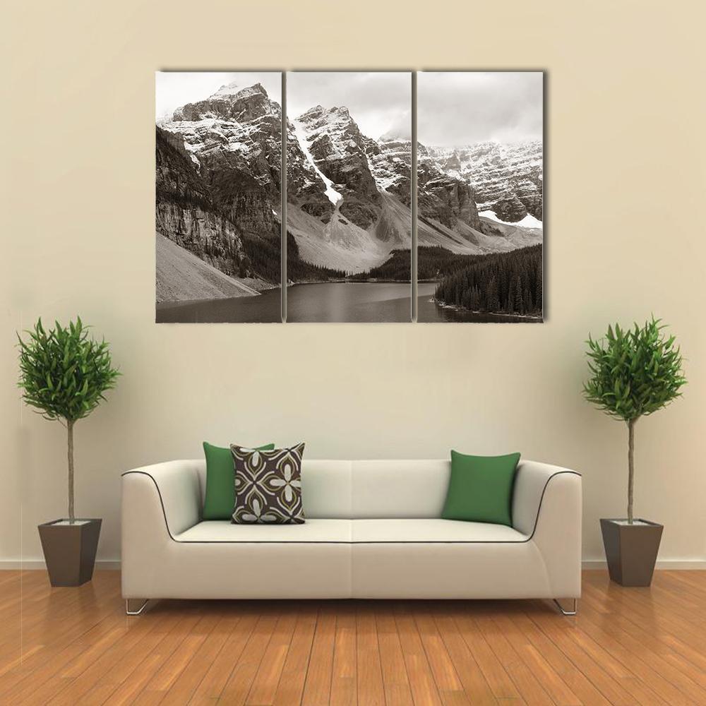
Photography is the backbone of this collection, and it splits into a few clear groups. Travel and landmark images cover bridges, cathedrals, city skylines and coastlines. Nature and landscape work covers mountains, forests, water and open country. There is a run of architectural and structural work where the subject is line and geometry rather than place. Alongside the photography sit graphic and abstract pieces, sports and figurative images, and a group of minimalist compositions where most of the frame is empty.
Most of the pieces here carry a full range of greys, not just the two extremes, and that middle range is what decides how a print reads on a wall. High-contrast images with deep blacks and clean whites feel graphic and modern, and they hold their own on a busy wall. Images weighted toward the lighter greys feel soft and atmospheric, and they suit bedrooms and small rooms where a hard black rectangle would feel heavy. If a room already feels dark, choose a print where white dominates. If it feels flat, choose one with real black in it.
Almost anything, which is the point, but three pairings do the most work. Warm wood and leather stop monochrome from feeling clinical, which is why black and white photography suits mid-century and industrial rooms. Brass and gold accents pick up the whites and make the whole wall read as deliberate rather than plain. A single saturated accent, one orange cushion or one blue chair, reads far louder next to monochrome than it would next to a colored print, so a small amount goes a long way.
Use the two thirds rule: the artwork should span about two thirds the width of the furniture beneath it. Above a 72 inch sofa that means roughly 48 inches of artwork. Hang the center of the piece 57 to 60 inches from the floor, which puts it at standing eye level, or 6 to 8 inches above a sofa back so the two read as one group. Monochrome tolerates going large better than color does, because there is no hue to overwhelm the room, so if you are between two sizes take the larger one.
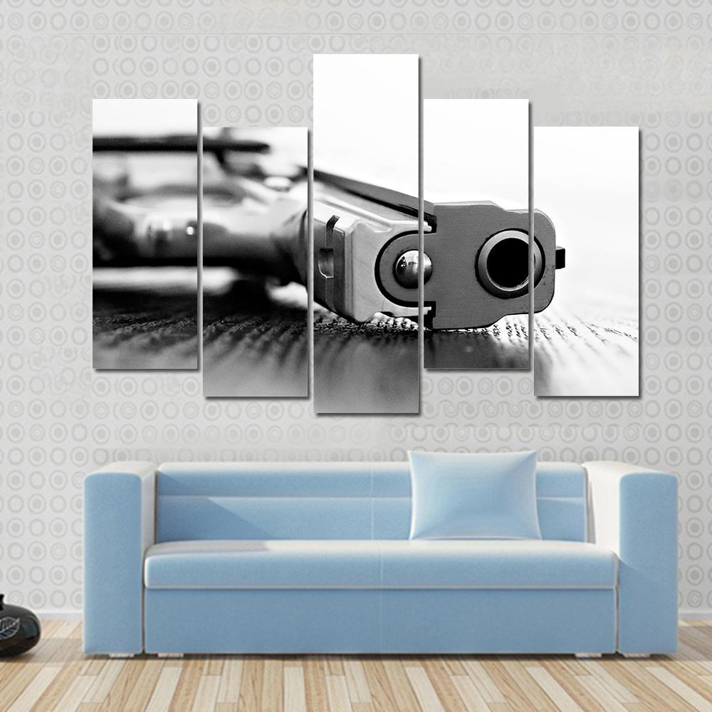
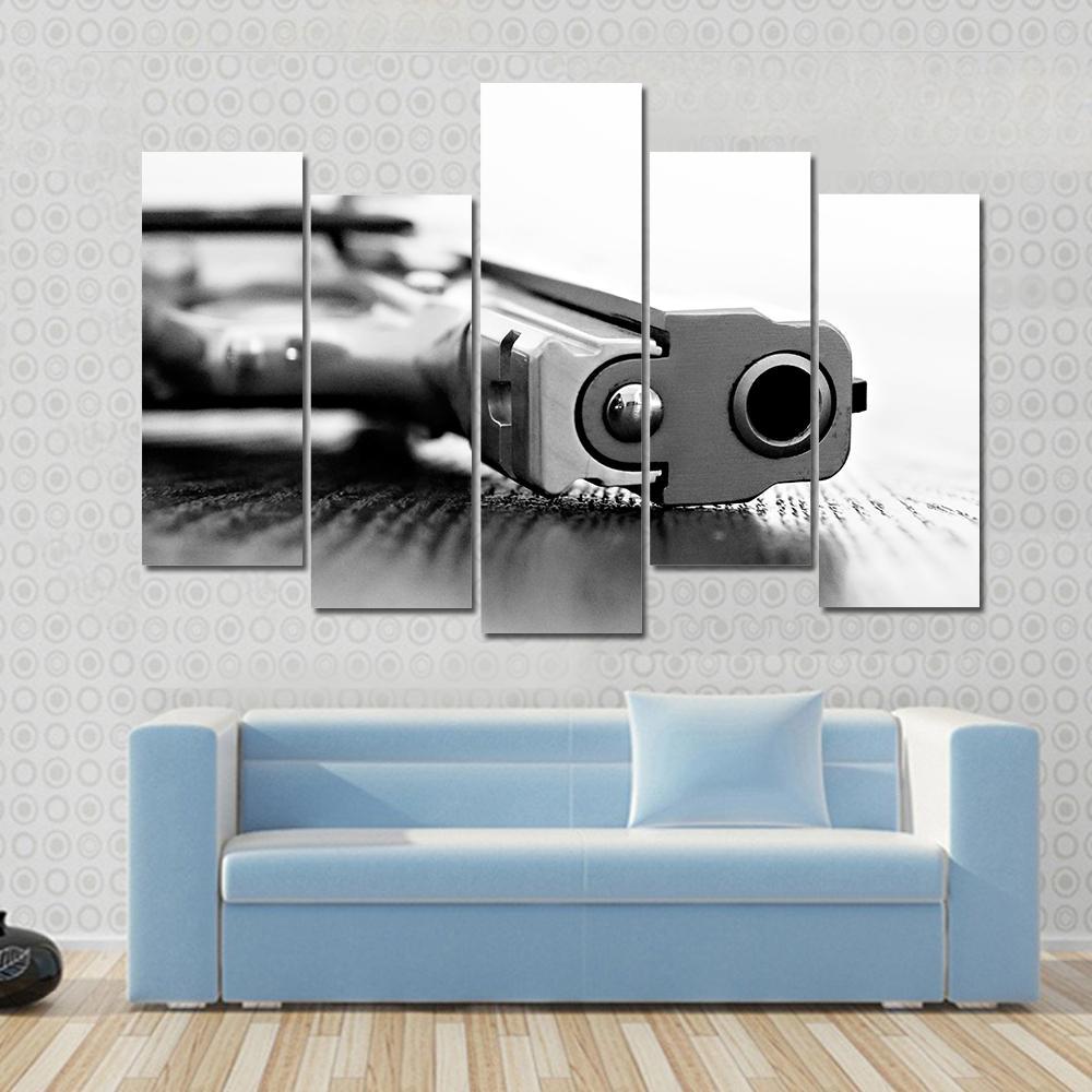
Horizontal pieces are offered as 1 Piece, 3 Horizontal, 4 Pop, 5 Star and 5 Pop, running from 24 x 16 up to 82 x 42 inches. Panoramic pieces come as 1 Piece and 3 Piece, from 36 x 12 up to 73 x 24, and a single panoramic canvas reaches 60 x 20. Vertical work is offered as 1 Vertical and 3 Vertical, from 12 x 24 up to 24 x 49. Multi-panel sets suit wide walls above a sofa or bed, where the gaps between panels give a long image room to breathe.
Living rooms take the largest pieces, usually a single wide canvas or a multi-panel set above the sofa. Bedrooms do better with lighter, softer images: mist, water, pale architecture, anything weighted toward the upper greys. Home offices and studies suit high-contrast graphic work and city photography, which reads well at close range and under artificial light. Hallways and stairwells are natural homes for vertical and panoramic formats, because the wall is narrow and the viewing distance is short.
The first is hanging it too high. Eye level is 57 to 60 inches to the center, and most people hang 6 to 10 inches above that. The second is choosing a print that is too small for the wall, which monochrome punishes more than color because there is no hue to fill the space. The third is putting a very high-contrast piece in a room lit only by warm lamps, where deep blacks turn muddy after dark. If the room is dim in the evening, favor a lighter image.
If you want the drama without the white, look at Black Wall Art. For the opposite, light and airy rather than graphic, see White Wall Art. Grey Wall Art covers the softer middle ground, including images with a faint color cast that are not strictly monochrome. For warm neutrals rather than cool ones, Neutral Wall Art and Brown Wall Art are the closest neighbours.
Every piece is printed to order, so nothing sits in a warehouse. The canvas is museum-quality and the inks are archival, which means they resist fading over time. Each canvas is stretched over a solid wooden inner frame and arrives ready to hang. Monochrome is the least forgiving subject to print, because any color cast in the ink shows immediately across a large flat grey, which is why the greys here are printed neutral rather than warmed. Free Shipping applies, and returns are free within 30 days.
Warm wood, leather and brass are the three that work hardest, because they stop monochrome from feeling cold. Beyond those, black and white art will sit with any wall color, which is why it is used in rooms that already have a strong palette. If you want the artwork to feel connected rather than separate, pick up one grey from the print in a cushion or a throw.
Monochrome, meaning one hue rendered across many values. In photography the precise term is greyscale, because the image carries lightness information only and no color information. Sepia is a close relative where the greys are shifted toward warm brown, and duotone uses two inks rather than one. Most work in this collection is true greyscale photography.
A single saturated accent, used sparingly. Red and orange give the strongest lift because they sit opposite the cool greys most monochrome photography carries. Gold and brass do the same job more quietly. The rule is one accent, not three: monochrome amplifies whatever color you place next to it, so a small amount reads much louder than it would beside a colored print.
Removing color removes the most emotional part of an image, so attention moves to composition, texture and light. That is why monochrome tends to read as calm, considered and slightly removed from the moment, and why it is used for portraits and documentary work. It also reads as older, because most photography before the 1960s was black and white, which is why a monochrome print can make a new room feel settled.
A single wide canvas above the sofa is the most reliable. A grid of three or five same-size prints suits a long hallway. A vertical piece works beside a doorway or in a stairwell where the wall is narrow. Mixing monochrome photography with one colored piece in the same frame size gives a gallery wall a focal point without making it busy.
Guides
Reading that goes with this collection, from our own blog.
 Winter Wall Art: A Year Round Subject, Not FestiveRead the guide
 Horse Wall Art: Silhouette, Subject and ScaleRead the guide
 Large Wall Art for Living Room: Size and PlacementRead the guide
 Staircase Wall Art: Size, Layout and HeightRead the guide
 Ivory Color: Pairings, Rooms and Wall ArtRead the guide
 The 7 Principles of Art, Explained With ExamplesRead the guide
 The 7 Elements of Art, Explained With ExamplesRead the guide
 Wall Art for Grey Walls: Warm or Cool GreyRead the guide