

WEDNESDAY SALE! • EXTRA 10% OFF + FREE SHIPPING DEAL | CODE: WEDNESDAY10
WEDNESDAY SALE! • EXTRA 10% OFF + FREE SHIPPING DEAL | CODE: WEDNESDAY10
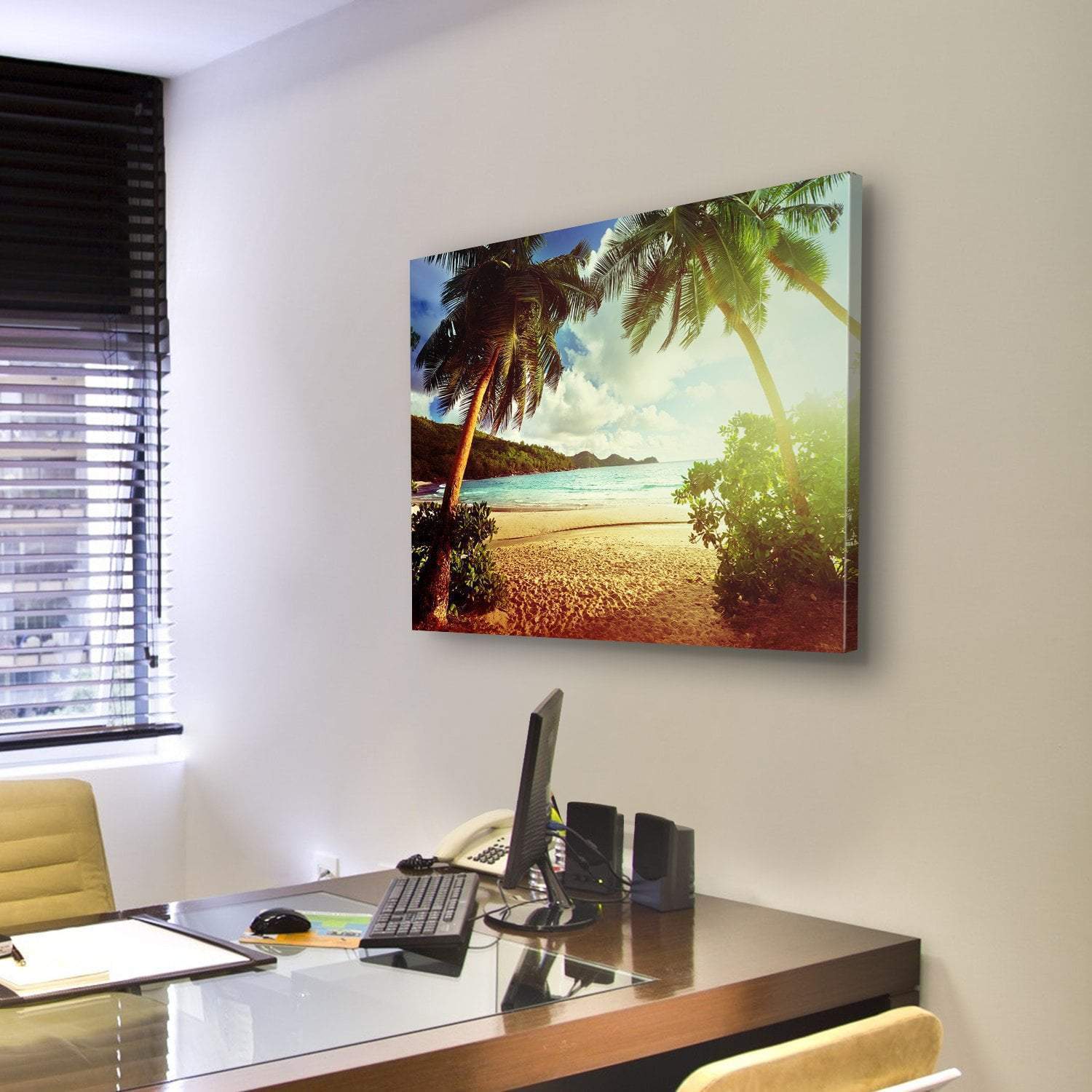
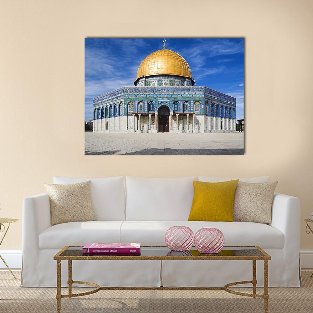
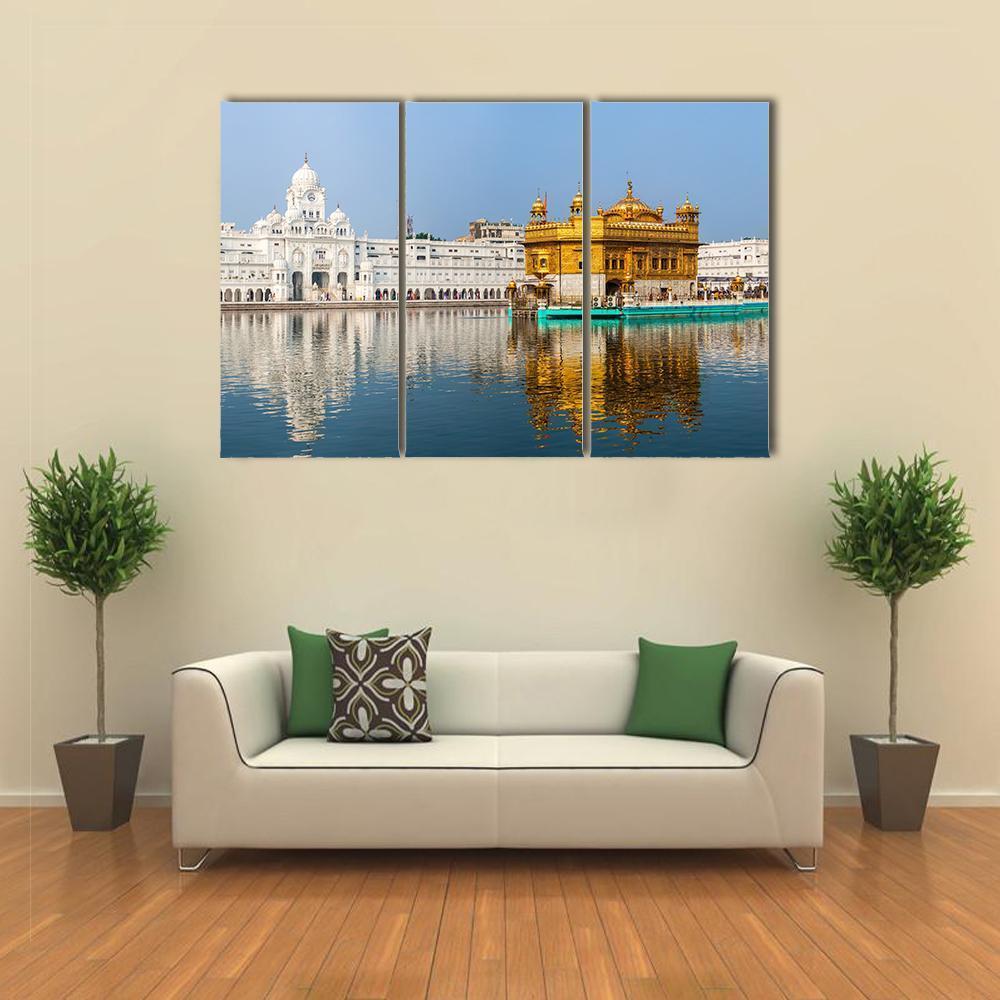
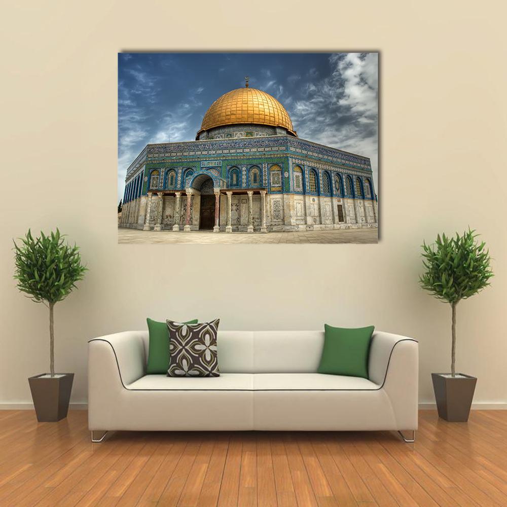
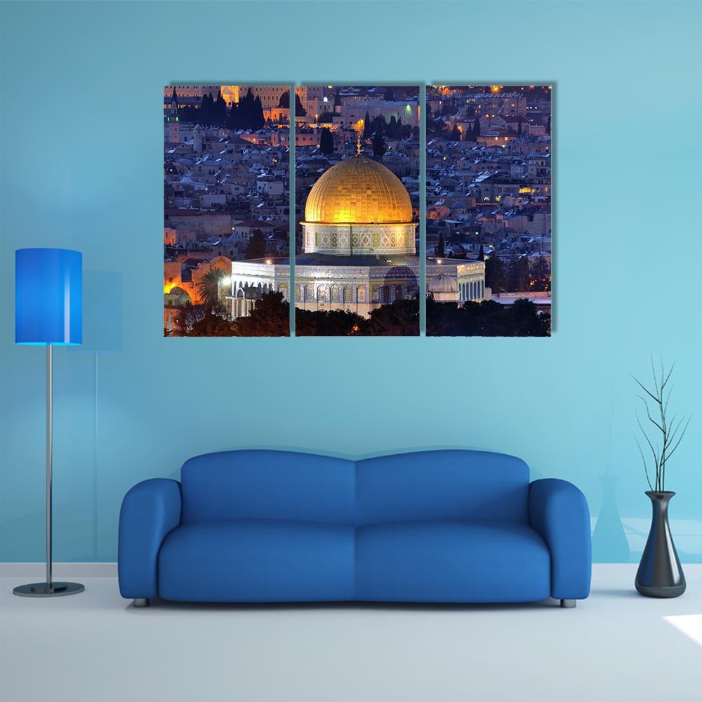
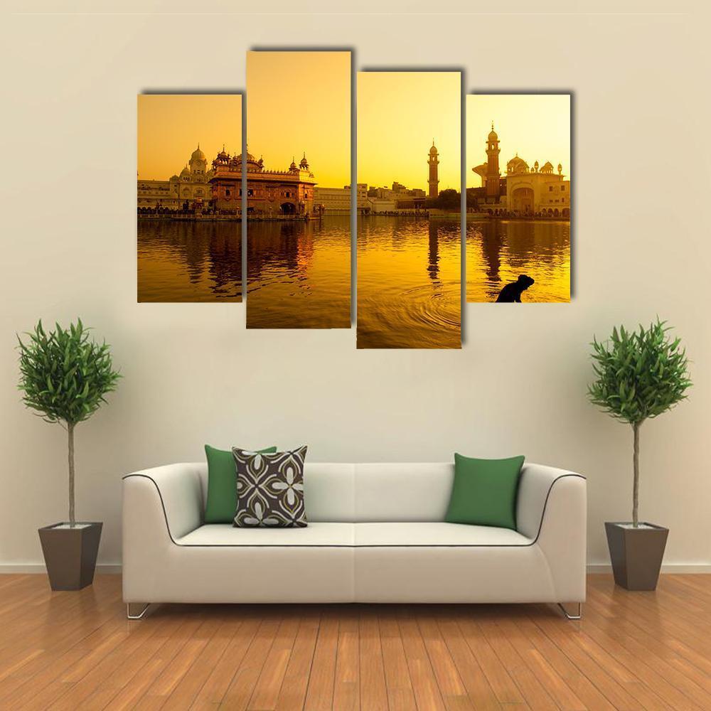
Gold wall art is artwork built on golden light: sunrise and sunset, city lights at dusk, autumn woodland, desert sun and warm lamplit architecture. The gold here is in the photograph, not in the material. These are canvas prints, so the color comes from the image rather than from metal or foil, which is what makes them work on an ordinary wall in ordinary daylight. Every piece is printed to order on museum-quality canvas with archival inks that resist fading, stretched over a solid wooden inner frame and ready to hang.
Gold in artwork is a warm yellow with high value and, usually, strong light behind it. It appears where the sun is low: the last hour before sunset, the first after sunrise, and the blue hour when artificial light turns amber against a darkening sky. That is why so much gold artwork is landscape and city photography rather than abstract work. It is worth being clear about what this is not. These are canvas prints and the gold is printed color, so there is no metallic sheen, no foil and no gold leaf. What you get is the light, not the metal.
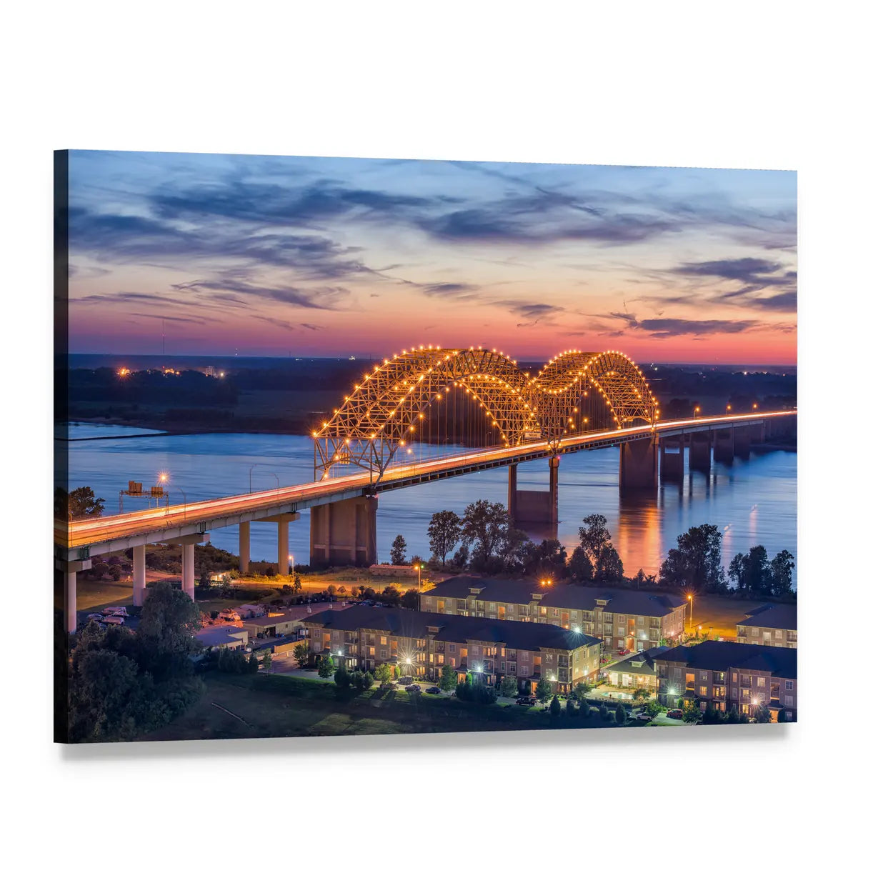
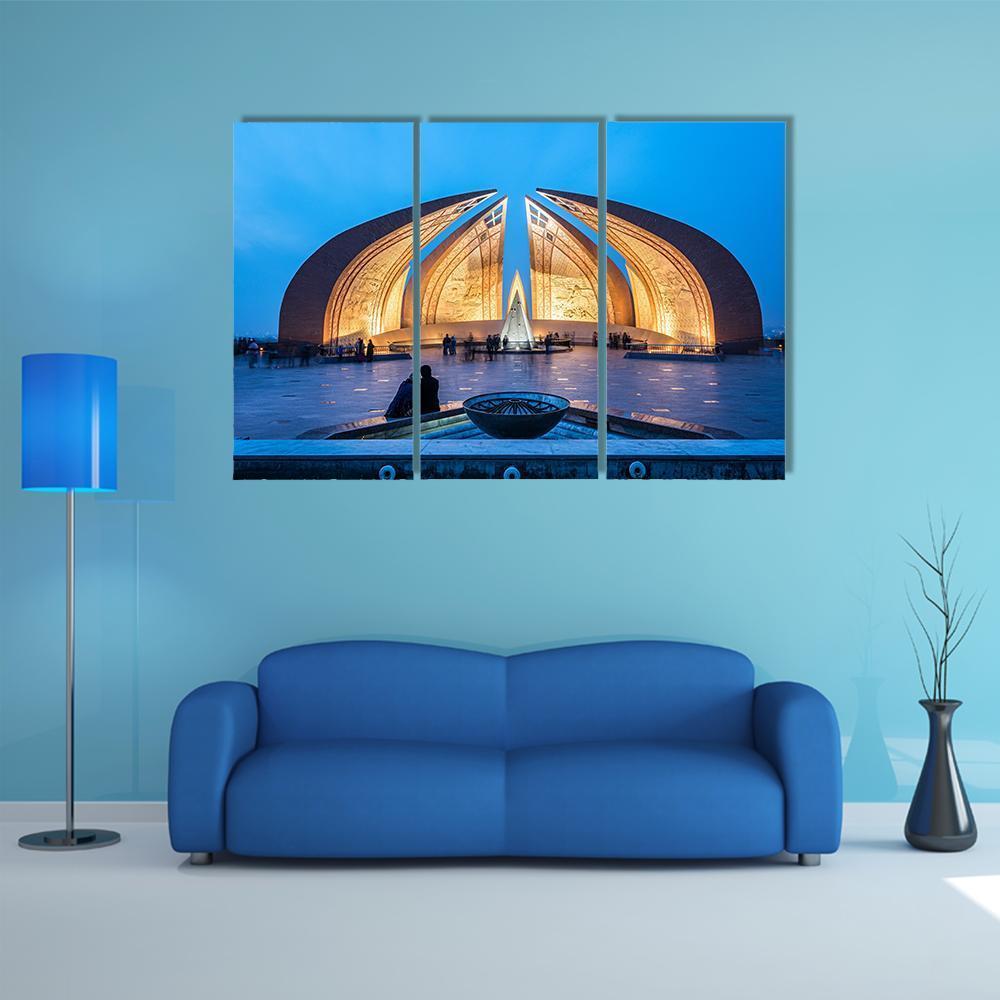
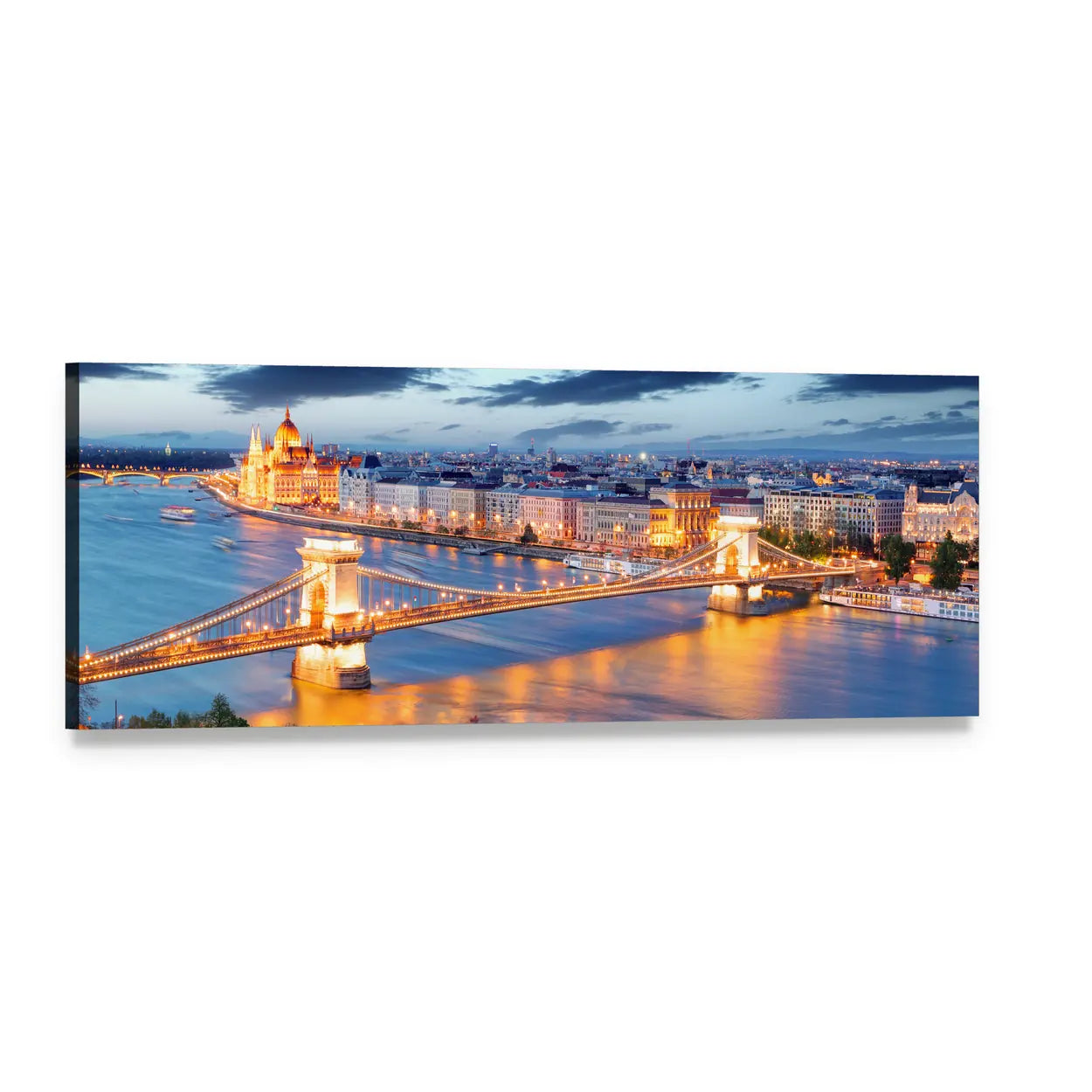
Most of this collection is golden hour photography, and it splits into three groups. Landscape work covers fields, deserts, mountains and forests lit from a low angle, where long shadows and warm haze do most of the work. City and architecture photography covers skylines, bridges and old towns at dusk, where street lighting reads gold against a deep blue sky. Water work covers harbours, lakes and coastlines at sunset, where the reflection doubles the gold in the frame.
Blue and orange sit directly opposite each other on the color wheel, which makes them a complementary pair and the strongest contrast available. Golden hour produces that pair naturally: warm low sun against a cool sky, or amber city lights against dusk. That is why a large share of the work here carries both, and it is the reason these images feel richer than a photograph taken at midday. If a room already has navy, denim or deep teal in it, gold artwork is the pairing that will make those colors look intentional.
Used at low saturation, gold behaves less like a color and more like a warm neutral. Wheat fields, pale sandstone and hazy morning light all read as gold without adding a hue the room has to accommodate. Used at full saturation, a deep amber sunset or a lit skyline, it becomes a focal point and needs space around it. Decide which job the piece is doing before you choose a size. A quiet gold piece can sit in a gallery wall; a saturated one should be alone.
Use the two thirds rule: the artwork spans about two thirds the width of the furniture below it, so roughly 48 inches above a 72 inch sofa. Hang the center 57 to 60 inches from the floor, or 6 to 8 inches above a sofa back. Saturated gold is one of the few palettes where going too large is a real risk, because a very warm image at scale will cast the whole room. In a small room, choose the quieter end of the range or drop a size.
Horizontal work is offered as 1 Piece, 3 Horizontal, 4 Pop, 5 Star and 5 Pop, from 24 x 16 up to 82 x 42 inches. Panoramic pieces come as 1 Piece and 3 Piece, from 36 x 12 up to 73 x 24, with a single panoramic canvas reaching 60 x 20. Vertical work is offered as 1 Vertical and 3 Vertical, from 12 x 24 up to 24 x 49. Sunsets and skylines suit panoramic and multi-panel formats, because the light sits in a horizontal band and the panel gaps do not cut through the subject.
Navy and deep blue are the strongest partners, for the complementary reason above. Warm woods, oak and walnut, extend the palette rather than contrasting with it, and give a quieter result. Cream and brown keep everything in the same warm family. Black gives a gold print structure and stops it reading as soft. The pairing to be careful with is cool grey, which can make warm gold look yellow rather than golden, especially under daylight bulbs.
Living rooms take the largest and most saturated pieces, usually a single wide canvas or a multi-panel sunset above the sofa. Dining rooms are the best room for gold, because warm artificial light in the evening reinforces the palette instead of fighting it. Bedrooms suit the softer end: hazy fields, morning mist, low contrast light rather than a burning sunset. Hallways and entryways take vertical gold work well, since a warm piece at the door sets the tone for everything behind it.
The first is hanging a heavily saturated sunset in a room lit by cool white bulbs, where the artwork and the light source disagree and the print looks orange. Warm bulbs fix this at no cost. The second is treating gold as a neutral when the piece is fully saturated; it is a focal color at that intensity and needs a quiet wall. The third is pairing gold artwork with a lot of literal gold hardware, which reads as a matching set rather than a room.
Yellow Wall Art is the brighter, cooler neighbour and is less about light than about color. Orange Wall Art holds the terracotta and burnt end of the same warmth. For gold at low saturation and low contrast, see Neutral Wall Art. Silver Wall Art is the cool counterpart. If you want the same golden hour subjects with the color removed entirely, Black and White Wall Art covers the same landscapes and skylines in greyscale.
Each piece is printed to order on museum-quality canvas using archival inks that resist fading, then stretched over a solid wooden inner frame and finished ready to hang. Warm yellows are among the most demanding colors to hold on canvas, because the eye notices a shift toward green or orange immediately in a large area of sky. The gold range here is printed to keep that band stable across the whole image rather than pushing saturation. Free Shipping applies, and returns are free within 30 days.
Not here. These are canvas prints, so the gold is printed color from the photograph rather than metal, foil or gold leaf. That means the piece looks the same from every angle and under any light, which a metallic surface does not. If you specifically want a reflective finish, that is a different product category and it is not what a canvas print does.
Navy and deep blue, because blue sits opposite the warm yellows in gold on the color wheel and gives the strongest contrast available. Warm woods and cream give a quieter result by extending the same palette. Black adds structure. Cool grey is the one to approach carefully, since it can drag warm gold toward looking yellow.
Golden hour is the period shortly after sunrise and before sunset when the sun sits low and its light travels through more atmosphere. That scatters the blue wavelengths and leaves the warm ones, so everything is lit amber and shadows run long. It is the reason most gold artwork is landscape or city photography: the color comes from the time of day rather than from the subject.
It works well with warm grey and needs care with cool grey. Warm grey shares gold's yellow bias, so the two sit together comfortably. Cool grey has a blue bias, which creates contrast that can read as a clash at close range rather than a deliberate pairing. If the walls are cool grey, choose a gold piece that also contains blue, and the two will resolve.
Warm palettes have been growing for several years, and interest in warm neutrals and earth tones is rising rather than falling. Gold artwork is more durable than gold hardware because it reads as light rather than as a finish, and light does not date. The safest version is a golden hour photograph, which will still look current when a particular metal finish has moved on.
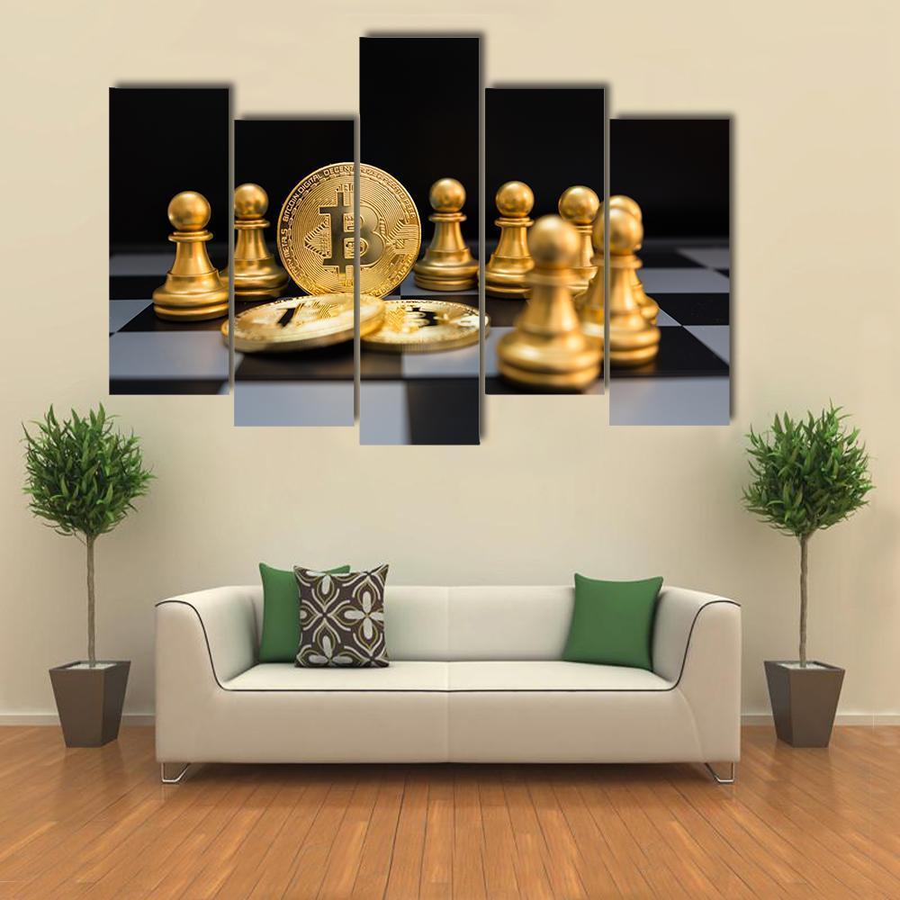
For two colors rather than one, see Black and Gold Wall Art, where that gold sits against a black ground.