















Burgundy Wall Art
Burgundy wall art brings the deepest of the reds into a room: a wine dark shade with a purple brown undertone that reads formal, warm, and sure of itself. Each piece in this collection is here because burgundy is the dominant color of the artwork itself, and that color arrives in memorable ways, spanning national flags with deep maroon fields, sunrise water, a Japanese garden bridge, and the felt of a snooker table. The shade suits dining rooms, dens, studies, and traditional rooms built around dark wood and leather. Every canvas is printed to order and arrives ready to hang.
What Shade Is Burgundy?
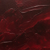
Burgundy is red darkened toward purple and brown, named for the color of red wine. It sits between crimson, which is brighter and cleaner, and plum, which tips fully into purple; maroon is its browner twin. The purple undertone is the tell. Where crimson flashes, burgundy smolders, and in low light it can read nearly as dark as espresso. That depth is what makes the shade feel dressed up. It carries the warmth of any red with none of the alarm, which is why it has held its place in libraries, dining rooms, and tailoring for generations.
Why People Search For Burgundy Wall Art
People usually come to burgundy wall art with a room half built: leather seating, dark wood shelves, brass hardware, or a rug that already carries the wine tone. Artwork in the same shade completes that scheme without introducing a new color to manage. Burgundy also answers a mood. It is the red of quiet confidence rather than energy, so it suits spaces made for long dinners and slow evenings. And because the shade is dark, it gives a wall real weight, doing for a room what a navy feature wall does, but with warmth in place of cool. Interest in the color climbs as the weather cools, since wine tones read as sweater season indoors, yet a burgundy canvas keeps earning its wall in July, the way a leather chair does.
Flags, Sunrise Water, And Deep Red Scenes
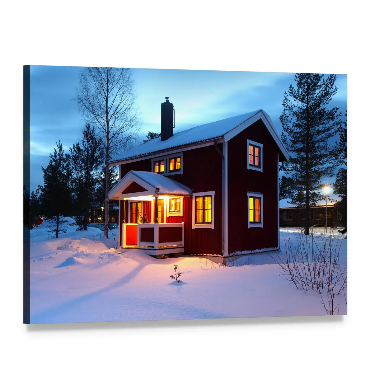
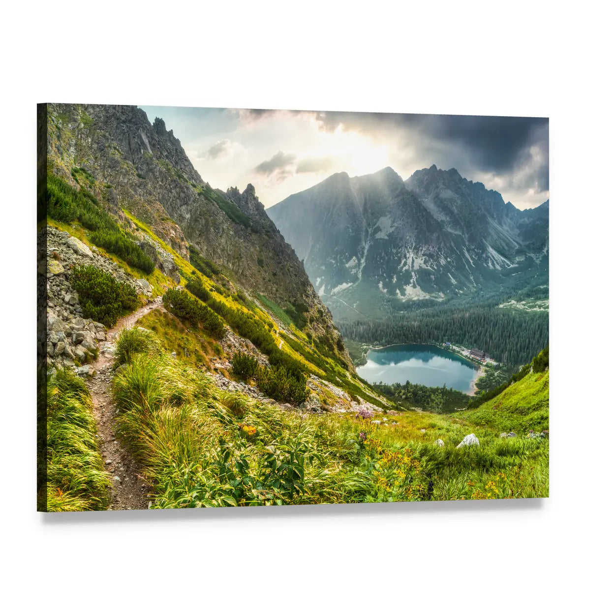
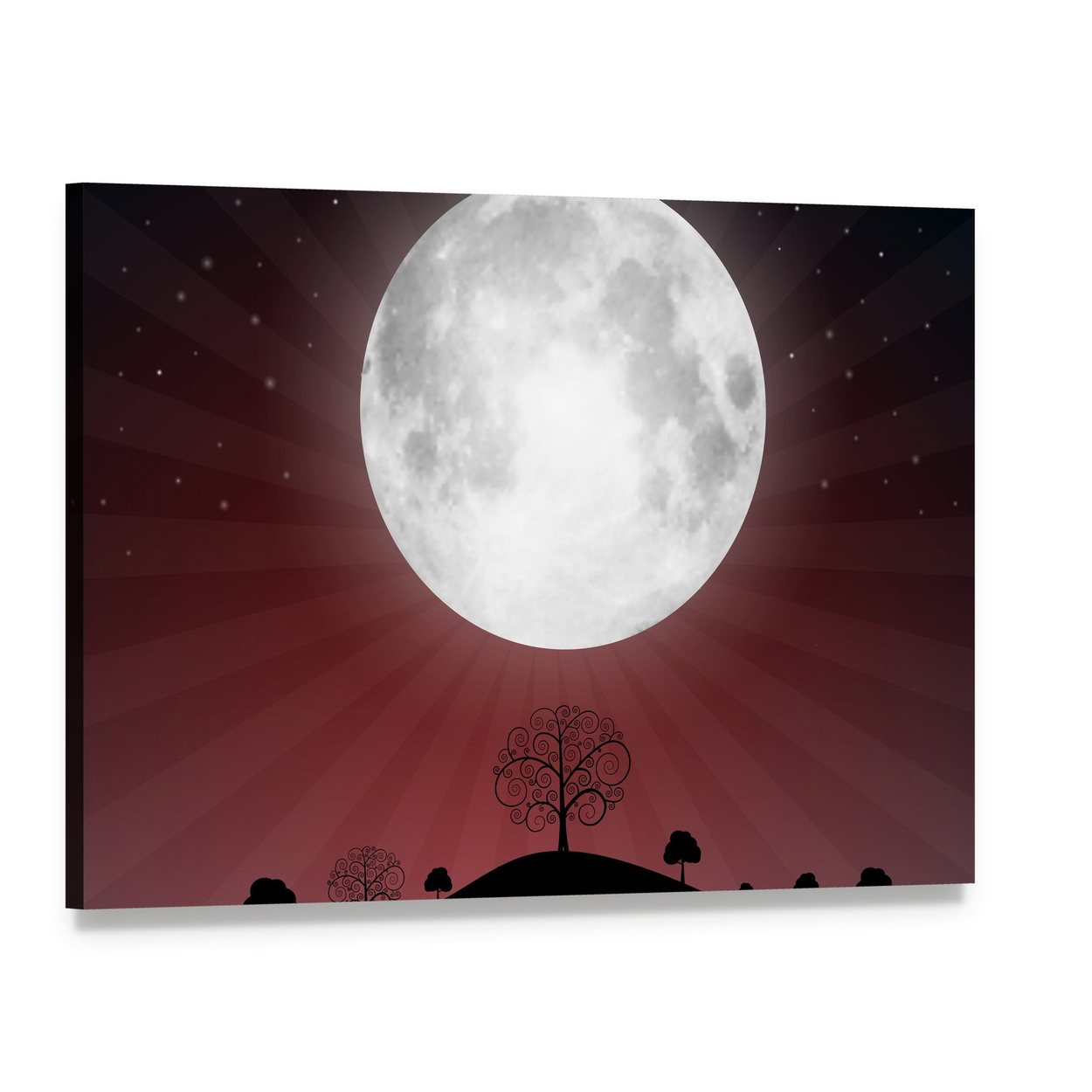
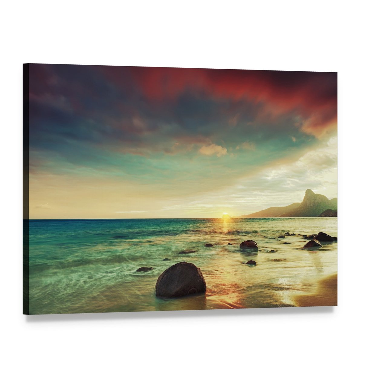
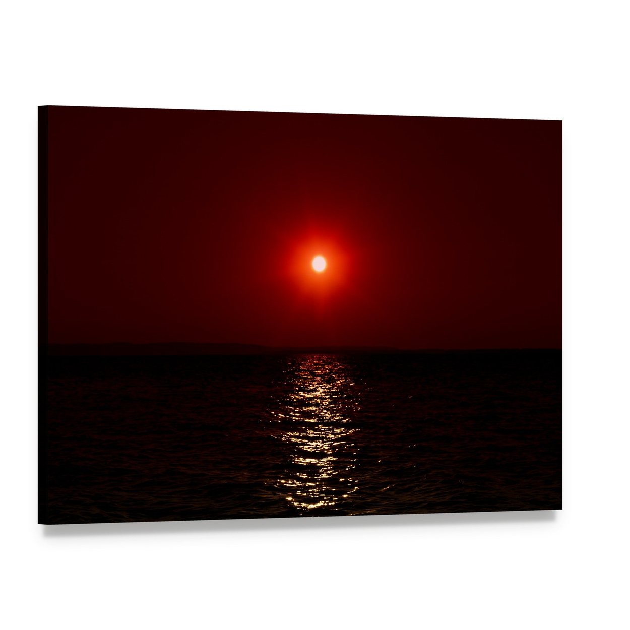
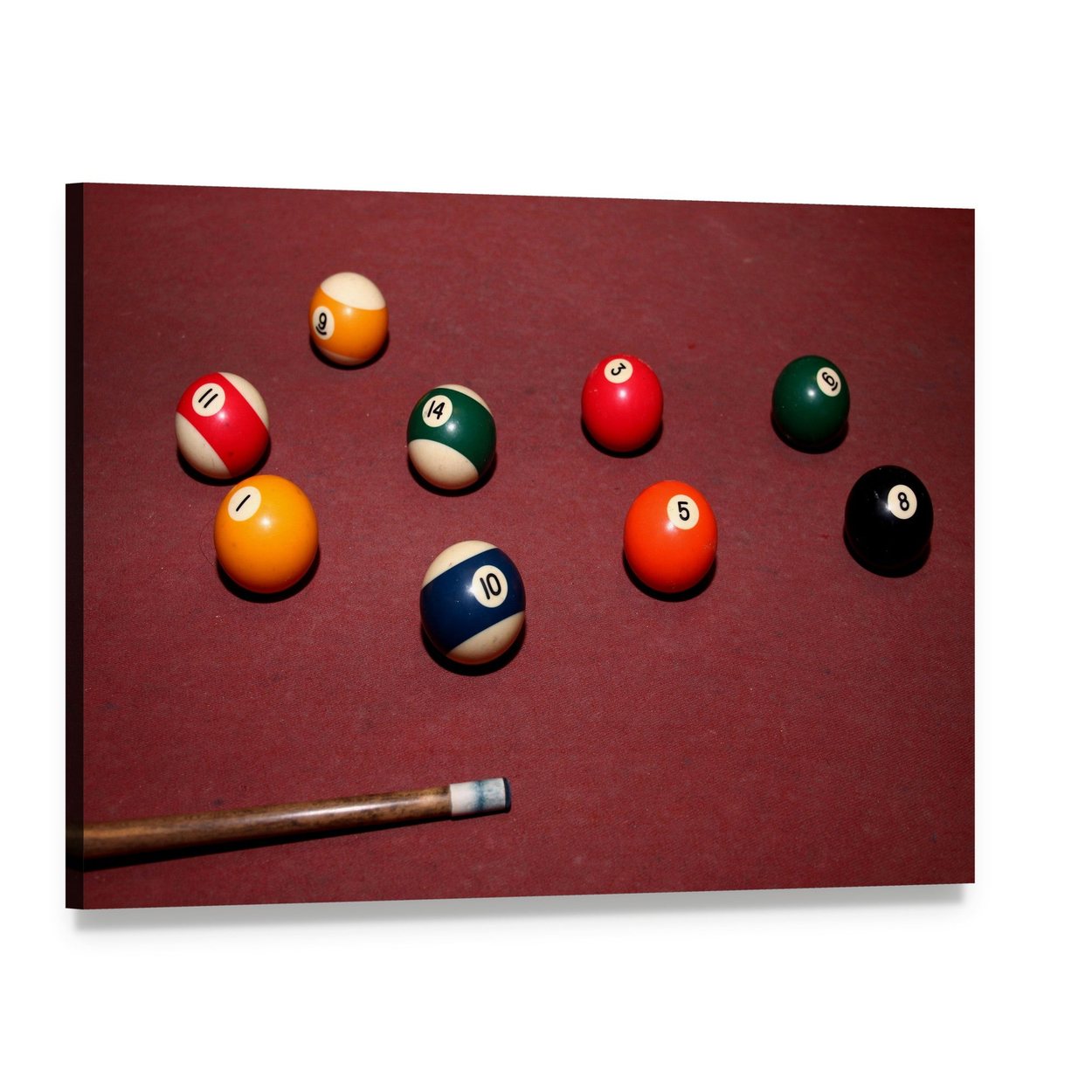
Flag artwork leads this collection. Qatar's maroon and white field appears waving close up, rendered as a geometric design, and painted across brick; Latvia's deep carmine bands and Sri Lanka's flag with its gold lion emblem carry the same wine palette. Beyond the flags the shade turns atmospheric: sunrise over the sea, dawn at Poprad pond, a full moon glowing over silhouetted hills, and an arched bridge in a Japanese garden. A snooker table's rich burgundy felt supplies the games room piece, and a sunset on Mars pushes the color into space. What unites them is depth, red brought all the way down to wine.
White And Gold Lift Burgundy Best
White is the most common companion color inside this artwork, with orange, gray, gold, turquoise, and green behind it. That ranking is worth copying at home. Burgundy absorbs light, so it needs a lifting partner: white keeps it crisp, gold makes it feel ceremonial, and gray keeps it modern. The flag pieces show the effect clearly, since each sets deep red against pale bands or bright emblems. In a room, repeat the trick with white trim, brass or gold accents nearby, or pale upholstery below the canvas, and the burgundy will read as a deliberate choice rather than a dark corner.
Burgundy Is A Warm, Evening Friendly Color
Nearly every piece in this collection measures warm, which is exactly what the shade is for. Burgundy comes alive in evening rooms. Under lamplight the wine tones glow, which is why the color has always belonged to dining rooms and dens. In thin daylight it flattens toward brown, so give a burgundy canvas either good natural light or deliberate warm lighting, and avoid the dim corner where its detail disappears. Keep it out of harsh direct sun as well. The archival inks resist fading, and steady, warm, indirect light shows this shade at its best for the longest time.
Which Rooms Suit Burgundy Wall Art?
The dining room is burgundy's home territory, where the shade deepens candlelight and flatters wood; our dining room wall decor collection continues that mood. A den or games room follows naturally, and the snooker scene here belongs on exactly that wall; browse man cave wall decor for its neighbors. A study or home office lined with books takes the shade well, since burgundy sits comfortably beside leather spines and dark shelving. Bedrooms can carry it too, provided plenty of white bedding and pale surfaces balance the depth. Bright, minimal rooms are the one setting where the shade can feel out of place.
Burgundy Canvas Sizes And Layouts
Size the artwork to what sits under it: about two thirds of the furniture's width, so a 72 inch sideboard takes a canvas around 48 inches wide. Horizontal scenes come as 1 Piece, 3 Horizontal, 4 Pop, 5 Star, and 5 Pop layouts, spanning 24 to 82 inches overall, with 48 x 32 the widest single horizontal canvas. Panoramic pieces come as 1 Piece or 3 Piece from 36 x 12 to 73 x 24, and a single panoramic canvas reaches 60 x 20. Vertical layouts run 12 x 24 to 24 x 49. Square artwork comes as a 4 Square grid of four panels at 17 x 17, 37 x 37, or 63 x 63 overall.
Common Mistakes With Burgundy Wall Art
The first mistake is hanging burgundy in a dark room with no relief. The shade absorbs light, so without white, gold, or pale wood nearby it can drag a wall down; give it one bright partner. The second is treating burgundy, maroon, and crimson as interchangeable when matching decor. The purple undertone of burgundy will sit awkwardly beside a rug woven in a browner maroon, so check undertones before ordering. The third is going too small. A dark canvas at a modest size reads as a gap on a pale wall; choose a generous size or a multi panel set so the color registers as intentional.
What Pairs With Burgundy Wall Art?
Burgundy pairs upward and outward. For a tonal red wall, place it beside the brighter pieces in crimson canvas art, or drift toward the purple side with plum wall art. For lift, echo the emblems and accents in these scenes with gold wall art nearby, a pairing that has meant luxury for centuries. The broader family lives in our red wall art collection. Around the room, cream, camel, forest green, and walnut all sit comfortably with wine red, while brass and aged leather deepen the club room mood.
How Each Burgundy Canvas Is Made
Every burgundy canvas is printed to order on museum-quality canvas with archival inks that resist fading. The print is stretched over a solid wooden inner frame and arrives ready to hang, with nothing to assemble. Layouts run from a single canvas to multi panel sets of three, four, or five pieces in the sizes listed above. Every order includes Free Shipping and 30-day returns. A shade this deep depends on the light it hangs in, so it helps that you can judge the wine tone on your own wall and return it within 30 days if the room asks for something brighter.
Common Questions
What Colors Go With Burgundy Wall Art?
White and gold are the strongest partners, and both already appear inside this artwork, from pale flag bands to a gold lion emblem. Gray keeps burgundy modern, cream and camel soften it, and forest green or walnut deepen the traditional mood. Give the shade at least one bright companion so it reads as rich rather than dark.
What Is The Difference Between Burgundy And Maroon?
Burgundy carries a purple undertone, taken from red wine, while maroon leans brown. Crimson is the brighter, cleaner red beside both. The three look close on a screen but part ways on a wall, so match artwork to the undertone your rug, sofa, or paint already uses rather than to the name alone.
Which Rooms Suit Burgundy Wall Art?
Dining rooms first, since the shade deepens under evening light and flatters wood furniture. Dens, games rooms, studies, and home offices follow, anywhere leather and dark shelving already live. Bedrooms work when white bedding balances the depth. The shade struggles only in bright minimal rooms that are built to stay visually light.
Is Burgundy Wall Art Too Dark For Small Rooms?
No, but it needs handling. In a small room, choose one burgundy canvas with white or pale tones inside the scene, keep the surrounding wall light, and light it well. Depth on one wall can make a small space feel finished rather than cramped; several dark pieces together are what shrink it.
What Size Burgundy Canvas Should I Choose?
Use the two thirds rule: artwork about two thirds the width of the furniture beneath it. Horizontal layouts span 24 to 82 inches overall, the widest single horizontal canvas is 48 x 32, panoramic pieces reach 73 x 24, and vertical layouts run up to 24 x 49. Dark shades reward a generous size.