

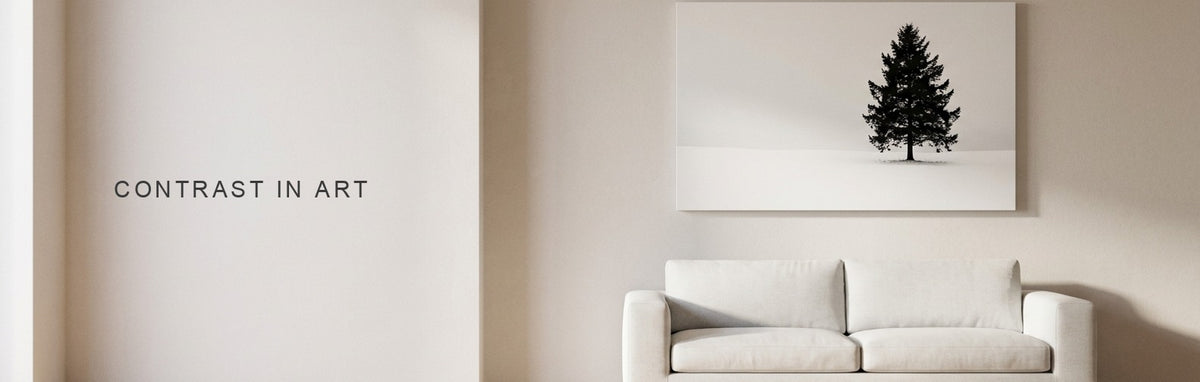
Contrast in Art: Value, Color and Texture
Contrast in art is a difference the eye can read: light against dark, warm against cool, large against small, rough against smooth. On canvas it decides what you notice first and from how far away. This guide shows each kind in real pieces, then how your wall, your room and panel gaps change it.
- Value contrast carries furthest: black trunks on a white snow path read from across a room, while a gray picture on a gray wall fades.
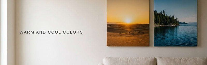
- Blue and orange are opposites on the color wheel, so a small orange patch on a large blue field is the first thing you see.
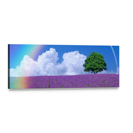
- One small subject in a wide format, such as a tree in a 60 x 20 inch panoramic, gets its contrast from scale.
- A half inch panel gap shows as a thin line across pale areas and hides in dark ones.
- Hang the center of a canvas 57 to 60 inches from the floor, or leave 6 to 8 inches above furniture.
What is contrast in art, and which kinds should you know?
Contrast is the difference between two neighboring parts of a picture, and the eye finds every edge, shape and focal point through it. It is one of the principles of art, and it works on the elements: value, color, size, shape and texture. Johannes Itten, who taught at the Bauhaus, split color contrast into seven kinds: hue, light and dark, cold and warm, complementary, simultaneous, saturation and extension. The table keeps the five that matter most on a wall, each with a piece that shows it.
| Kind | What differs | Where it shows in a canvas |
|---|---|---|
| Value (light and dark) | Pale beside deep | Bare black trees on a snow path |
| Complementary | Opposites on the color wheel, such as blue and orange | Orange life vests on blue water |
| Extension | A small patch of one color against a large field of another | Two kayakers on open water |
| Scale | One small subject in a large space | A lone tree on a lavender field |
| Texture | Thick or ridged beside smooth | Heavy strokes of yellow paint |
How does value contrast work in a black and white canvas?
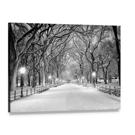
Value contrast is the strongest kind, because the eye reads brightness before it reads color. A black and white canvas removes everything else, so the picture depends on where the darks and lights sit. In Winter Park Path with Snowy Trees, shown here as a 3 Horizontal set, bare black trunks and branches arch over a white path, and the lamps glow against the dark bark. The path reads from across the room.
Two other black and white pieces show how far the range goes. Nighttime Colosseum in Black and White sets pale, lit stone arches against a solid black sky, and Ama Dablam in Black and White runs from black rock to white snow with a gray sky above. The Black and White Wall Art collection holds pieces built on the same split.
| Piece | Darkest area | Lightest area | How it reads |
|---|---|---|---|
| Winter Park Path with Snowy Trees | Trunks and branches | Snow on the path, the lamps | High, clear from across the room |
| Nighttime Colosseum in Black and White | The night sky | Lit stone arches | Very high, the arches glow |
| Ama Dablam in Black and White | Shadowed rock | Snow on the peak and ridges | High, with a mid-gray sky |
| Autumn Trees in Mist | Trunks at the left | Mist and a pale sun | Low, trunks fade toward the right |
Pro tip: Squint at the product photo, or shrink it to thumbnail size. If the main shape is still clear, the picture has strong value contrast and will read from across the room. If it dissolves into gray, it is a quiet piece.
Watch out: A black and white picture is not automatically high in contrast. Autumn Trees in Mist lives in grays, and its row of trunks fades into the mist on the right, so choose it for a calm room and not for a focal wall.

Which canvases pair blue with orange?
Blue and orange are opposites on the color wheel, so each looks stronger beside the other. The pair appears in two ways on canvas. One is complementary contrast, where large areas of both colors meet. The other is extension, where a small patch of one color sits in a large field of the other.
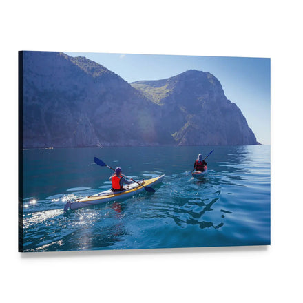
Kayaker in Orange Vest by Coastal Cliffs is the extension version, shown here as a single canvas. Two paddlers in orange-red life vests cross deep blue water below blue-gray cliffs, and the small warm patch is the first thing you see. Lake Tahoe Sunset with Pine Silhouette and Cloudscape Over Sea are the complementary version: a low orange sun over blue water in the first, and an orange sun on the horizon between dark clouds and blue sky in the second.
Browse the Blue and Orange Wall Art collection for more pairs, and our warm and cool colors guide covers the temperature side of the contrast.
Pro tip: For a calm room, choose the extension version, where the orange is a small patch. For a room that needs energy, choose a piece where a large orange sky meets blue water.

How does one small subject create scale contrast?
Scale contrast puts one small subject in a very large space, so the subject reads at once and the space reads as calm. Lavender Field with Lone Tree and Rainbow Panoramic is a clear case. One green tree stands right of center in a long lavender field, under white clouds and a blue sky, with a rainbow at the left. The tree is a small shape against a wide field, and the purple, green and blue each differ from their neighbor.
A panoramic canvas leaves more empty space either side of the subject than a standard shape does, because a 60 x 20 inch piece is three times as wide as it is tall. The single panoramic comes in 36 x 12, 48 x 16 and 60 x 20 inches, and the three piece set in 25 x 8, 56 x 18 and 73 x 24 inches. The Panoramic Wall Art collection holds more pieces with one subject in a wide field.
Watch out: Scale contrast needs one clear subject. Two similar trees read as a pair, and the eye stops choosing. Look for a piece with one subject, a clear horizon and nothing else close to it.

Where does texture contrast show up in a printed canvas?
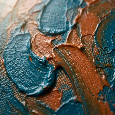
In a printed canvas the texture is part of the picture: the ridge you see is printed, so it shows as light and shadow inside the image. Gold Impasto Brushstrokes Abstract shows it well. Thick strokes of yellow and ochre fold over each other, with deep red-brown in the folds and bright highlights along the ridges. The contrast is between the lit ridge and the dark fold beside it.
A piece like this suits a smooth, plain wall, where the strokes are the only surface detail in the room. Pieces with soft gradients or flat color suit a wall that already carries texture. The Abstract Wall Art collection holds both kinds, so look at the close-up photo before you choose.
Watch out: Do not expect a raised surface. The strokes are printed on the canvas, so the texture you see is in the picture, not under your fingers.

How much contrast does your wall and room need?
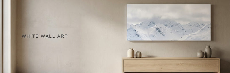
Match the contrast of the picture to the job it has in the room: high contrast makes a focal point, and low contrast keeps the picture in the background. The wall behind it counts too. A dark picture on a pale wall reads as a window, and a pale picture on a dark wall reads as a light. A mid-gray picture on a mid-gray wall reads as nothing.
| Where it hangs | Contrast to choose | Piece | Layout and size |
|---|---|---|---|
| A white or pale living room wall | High | Ama Dablam in Black and White | 1 Piece, 48 x 32 inches |
| A bedroom | Low | Autumn Trees in Mist | 1 Piece, 36 x 24 inches |
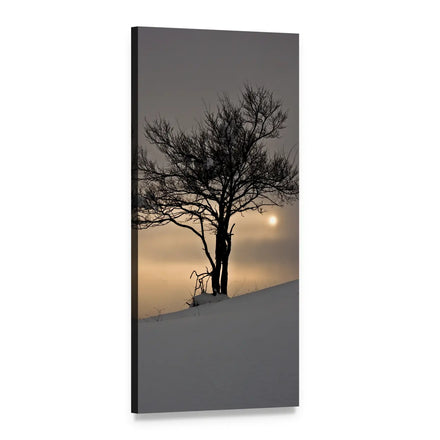
| An entry or hall | One dark shape on a pale ground | Lone Tree on Snowy Hill at Sunrise Vertical | 1 Vertical, 24 x 48 inches |
An entry or hall is where a vertical piece earns its place. Lone Tree on Snowy Hill at Sunrise Vertical is one dark, bare tree against a pale, hazy sky, so it reads from the far end of a hall. Our guide to art for white walls and the hallway and entryway guide cover the walls in the table, and the Vertical Wall Art collection holds more tall pieces.
A 24 x 48 inch 1 Vertical on a bare hall wall goes up with its center at 57 to 60 inches from the floor, so the edges land like this.
| Measure | Result |
|---|---|
| Bottom edge | 33 to 36 inches from the floor |
| Top edge | 81 to 84 inches from the floor |
| Space above under an 8 foot ceiling | 12 to 15 inches |
Pro tip: Hold a phone photo of the piece against the real wall and squint. If the edge of the picture vanishes, the wall and the picture sit too close in lightness. Our picture hanging height guide covers the center line.

How do panel gaps change a high contrast picture?
Every gap between panels is a thin line, and it shows where the picture is pale and hides where the picture is dark. Sets are designed on a half inch gap, and the eye completes the image across it. In the Winter Park Path 3 Horizontal set above, the gaps run as thin dark lines through the white snow of the path and merge with the trunks higher up.
Nighttime Colosseum in Black and White, shown here as a 5 Star set, works the other way. The raised center panel carries the black sky above the arches, so the gaps that cross black sky disappear, while the ones through lit stone show as thin lines. A set is the better choice when the darks dominate, and a single canvas is the better choice when a large pale area is the focal point.
| Layout | Gaps | Suits | Overall sizes (inches) |
|---|---|---|---|
| 1 Piece | None | Large pale areas such as snow, sky or mist | 24 x 16, 36 x 24, 48 x 32 |
| 3 Horizontal | Two vertical gaps at about a third and two thirds of the width | Dark masses where the gaps can fall | 25 x 16, 37 x 24, 49 x 32 |
| 5 Star | Four gaps, with a raised center panel | Dark skies and silhouettes | 42 x 21, 62 x 32, 82 x 42 |
Watch out: Do not guess where the gaps land. Each listing carries a photo of every layout on the real picture, so open the layout you plan to order and look at what the panel edges cross. Our guide to arranging a 3 piece canvas set covers the spacing, and the Multi Panel Wall Art collection holds every split layout.

What should you check before you order?
- The squint test: the main shape is still clear at thumbnail size, or you chose a quiet piece on purpose.
- The kind of contrast: value for distance, blue and orange for energy, scale for calm, texture for a plain wall.
- The wall: the picture and the wall differ in lightness, checked with a phone photo held against it.
- The layout: no gap crosses a pale focal point, checked on the layout photo in the listing.
- The size and height: center at 57 to 60 inches from the floor, or 6 to 8 inches above furniture and about two thirds of the furniture's width.
Start with the kind of contrast you want to see from across the room.
Black and White Wall Art for value, Blue and Orange Wall Art for color pairs, Panoramic Wall Art for scale, Abstract Wall Art for texture, Vertical Wall Art for halls and Multi Panel Wall Art for split sets.
Quick answers
Common Questions
What is the best definition of contrast in art?
Contrast is the difference between two elements placed side by side, such as light against dark, warm against cool, large against small or rough against smooth. It is one of the principles of art. It creates emphasis, because the eye goes to the point of greatest difference, and structure, because differences separate one shape from another.
What are 5 examples of contrast in art?
Value is black trees on a white snow path. Complementary contrast is orange life vests on blue water. Scale is one tree in a wide lavender field. Texture is thick, ridged strokes of paint beside smooth ones. Extension is a small patch of orange against a large field of blue. Each one appears in canvases we print.
What is contrast called in art?
Contrast is the name itself, and it is one of the principles of art. A specific kind takes its own name: value contrast for light against dark, complementary contrast for opposite colors, and scale contrast for large against small. Chiaroscuro is the Italian term for strong light and shadow used as a method.
What are the 7 color contrasts?
Johannes Itten, who taught at the Bauhaus, named seven: hue, light and dark, cold and warm, complementary, simultaneous, saturation and extension. Hue is the colors themselves, complementary is opposites on the wheel, simultaneous is a neutral that looks tinted by its neighbor, saturation is pure against dulled, and extension is a small area against a large one.
Does a panel gap change the contrast of a canvas?
Yes. A half inch gap shows as a thin line across pale areas, such as snow or sky, and hides across dark ones. A single canvas keeps a pale focal point whole, while a 3 Horizontal or 5 Star set suits a picture whose gaps fall on dark areas. Check the layout photo on the listing.
Shop this guide
The collections in this guide
Every collection this guide mentions. Each one opens on artwork printed to order on museum-quality canvas.



Pieces shown above
The pieces in this guide
Every piece this guide shows, printed to order on museum-quality canvas.
 Winter Park Path with Snowy Trees Canvas Wall ArtFrom $69.95
 Kayaker in Orange Vest by Coastal Cliffs Canvas Wall ArtFrom $69.95
 Lavender Field with Lone Tree and Rainbow Panoramic Canvas Wall ArtFrom $98.95
 Gold Impasto Brushstrokes Abstract Canvas Wall ArtFrom $69.95
 Lone Tree on Snowy Hill at Sunrise Vertical Canvas Wall ArtFrom $116.95

Keep reading
Read next
Guides that pick up where this one stops.