






Dusty Rose Wall Art: Blossom, Ink and Mandala
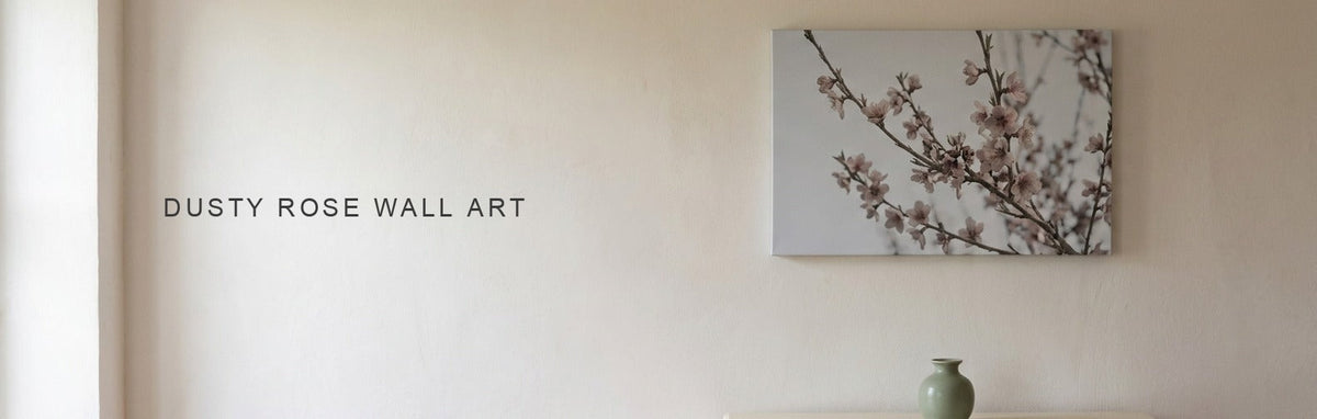
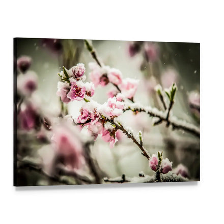
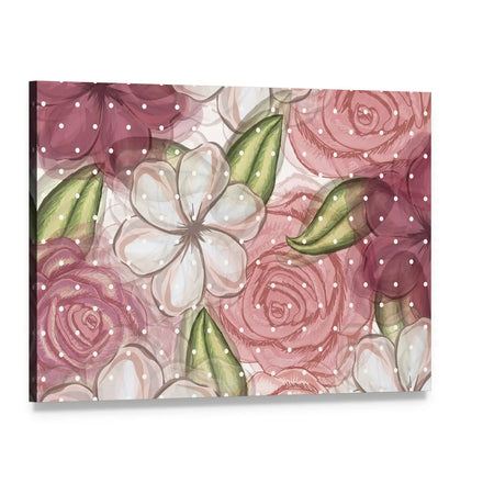
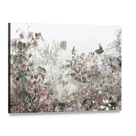
Dusty rose is pink with grey in it, which is why it behaves like a neutral. The range here is small and it is almost entirely soft-focus botanical and abstract: peach blossom under snow, watercolor spring flowers, roses against white, an alcohol ink pour, a mosaic mandala. Nothing in it is loud, which is the whole point of the color.
A small range is not a thin one. It means the choice is quick, and the pieces share a register closely enough that any two of them hang together.

Grey is what makes it dusty
Take a clear pink and pull the saturation down toward grey and you get dusty rose. That greyed quality is what lets it sit in a room without reading as a nursery or a candy shop, and it is why the color turned up so often in interiors once blush had run its course. It has the warmth of pink and the restraint of a neutral.
It is also why the pieces here are soft-focus. A hard-edged, saturated pink is a different color.

Blossom and petal are the natural sources
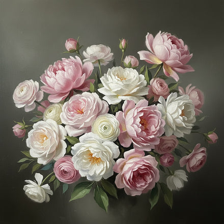
Peach and cherry blossom, roses, spring flowers in watercolor. These carry the color in its most literal form and they suit a bedroom, a dressing area or a bathroom-adjacent hallway, anywhere the point is softness. They read as season and light rather than as a design choice.
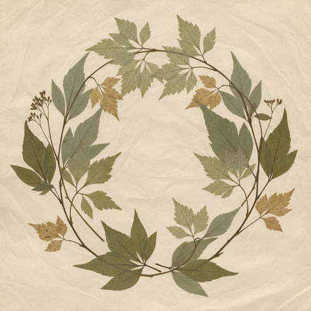
They also pair with green foliage inside the same frame, which is the pairing that keeps dusty rose from going saccharine.

The abstracts are the adult version
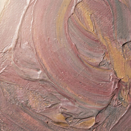
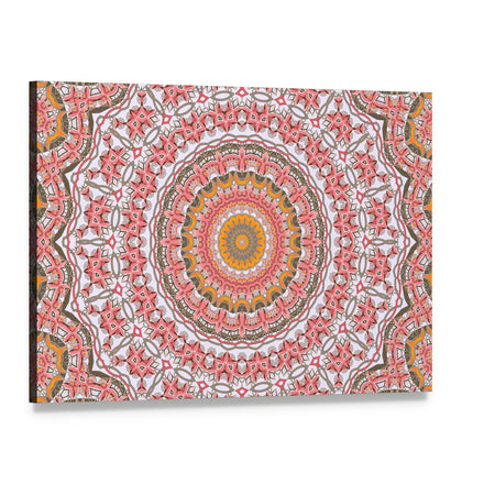
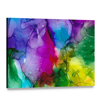
An alcohol ink pour and a mosaic mandala carry the color without the flowers, and they are the pieces to reach for when the room is a living room or a study and a botanical would feel too gentle. They hold the palette and lose the sweetness.
The mandala in particular reads as pattern first and pink second, which makes it the most flexible piece in the range.

What it pairs with
Sage and olive, because grey-green and grey-pink share the same muted register and read as one palette. Cream and warm white. Brass and gold, which is the metal that flatters the warmth. Charcoal, in small amounts, to keep it from floating.
Avoid pairing it with a clear bright pink, which makes dusty rose look faded, and with cool grey, which cancels the warmth that makes it work.
Where it sits against pink and blush
Blush is paler and warmer, closer to skin tone. Pink is clearer and more saturated. Dusty rose is the greyed middle, and it is the one of the three that reads as a color adults choose for a shared room rather than a child's. The wider pink range holds all three; this range holds only the greyed one.

What to browse
Dusty Rose Wall Art is the direct range. Pink Wall Art holds the wider family, Flowers Wall Art and Botanical Wall Art carry the blossom sources at depth, and Sage Green Wall Art is the pairing partner. The sage pairing guide covers that relationship from the other side, and the rose symbolism guide covers what the flower itself means.
Quick answers
Common Questions
What color is dusty rose?
Pink with grey pulled into it, so the saturation drops and it behaves like a warm neutral. It keeps the warmth of pink and gains the restraint of grey, which is why it works in shared adult rooms where a clear pink would not.
What does dusty rose wall art usually show?
Soft-focus botanicals and abstracts: peach and cherry blossom, roses against white, watercolor spring flowers, an alcohol ink pour, a mosaic mandala. The register is quiet throughout, because the color itself is. It is a small range, and the pieces share that register closely enough that any two of them hang together without planning.
What colors go with dusty rose?
Sage and olive green, because grey-green and grey-pink share the same muted register; cream and warm white; brass and gold, the metal that flatters the warmth; and a little charcoal to keep it from floating. Avoid clear bright pink, which makes dusty rose look faded, and cool grey, which cancels its warmth.
Which rooms suit dusty rose wall art?
Bedrooms and dressing areas for the botanical pieces, where softness is the point and the blossom subjects read as season and light. Living rooms and studies for the abstracts, which hold the palette without the flowers and lose the sweetness. The mandala reads as pattern first and pink second, which makes it the most flexible piece in the range.
How is dusty rose different from blush and pink?
Blush is paler and warmer, close to skin tone. Pink is clearer and more saturated. Dusty rose is the greyed middle of the three, keeping the warmth of pink with the restraint of a neutral, and it is the one most often chosen for a shared adult room rather than a child's. The wider pink range holds all three.
Shop this guide
The collections in this guide
Every collection this guide mentions. Each one opens on artwork printed to order on museum-quality canvas.

Pieces shown above
The pieces in this guide
Every piece this guide shows, printed to order on museum-quality canvas.
Keep reading
Read next
Guides that pick up where this one stops.