






What Colors Go With Sage Green
What colors go with sage green: warm neutrals, soft white, terracotta, muted navy and natural wood. It is a grey-green, so it behaves like a neutral rather than like a color, and the pairings that fail are the ones that treat it as a bright green. Cool grey and pure black are the two most common mistakes.
This is the pairing question specifically, not the subject question. If the aim is finding artwork that reads sage in the first place, the sage green wall art guide covers which subjects deliver the shade. This piece is about what to put beside it once it is on the wall.

Warm white is the safest partner, not cool white
Sage carries grey, and grey plus a cool white produces a flat, slightly clinical pairing where neither color does anything for the other. A warm white or a soft cream restores the difference: the warmth pushes the green forward and the sage in turn keeps the cream from reading yellow.
This is why sage works so well as gallery-wall matting and wall paint at once. Against warm white it stays visible without becoming the loudest thing in the room.

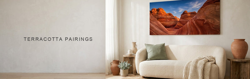
Terracotta is the complementary pairing that actually works
Green and red-orange sit opposite each other on the color wheel, and in their saturated forms that pairing is difficult to live with. Muted, it becomes one of the most reliable combinations in interiors: sage against terracotta gives the contrast of a complementary pair without the vibration, because both colors have had their intensity pulled down.
A sage landscape beside a terracotta-toned piece reads as a considered pairing rather than a clash, and the terracotta pairing guide approaches the same relationship from the other side.

Wood tone counts as a color in this decision
Sage sits beside natural wood better than almost any other painted shade, which is why it appears constantly alongside oak and walnut. The green reads as the botanical counterpart to the grain rather than as a competing decorative choice.
That has a practical consequence for framing and furniture. A sage piece above an oak sideboard needs less styling than the same piece above a white lacquer unit, because the wood is already doing half the pairing work.

Muted navy is the contrast that does not fight
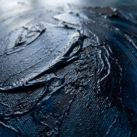
When sage needs a darker anchor, muted navy does the job better than black. Navy shares sage's greyed quality, so the two read as members of the same family at different weights, and the pairing gives depth without introducing a hard edge.
Black does introduce that hard edge. Against pure black, sage loses its warmth and starts reading as a washed-out grey, which is the opposite of the effect most people are after.
The pairings that fail, and why
Cool grey is the first. Sage already contains grey, so putting it beside a cool grey removes the only thing distinguishing it and the result reads as a mistake rather than a scheme. Bright, saturated green is the second: next to a true green, sage looks faded rather than sophisticated.
The third is high-contrast pure white with black accents. Sage is a low-contrast color and it needs a low-contrast setting to be read as intentional. Put it in a graphic black and white scheme and it reads as an accident.

What to browse
For the sage pieces themselves, Sage Green Wall Art is the direct range and Green Wall Art is the wider one. For the pairing partners, Beige Wall Art and Neutral Wall Art cover the warm neutral half and Navy Wall Art covers the dark anchor. The sage, olive or emerald comparison separates the three greens people mix up most.
Quick answers
Common Questions
What colors go with sage green?
Warm white and cream, terracotta and other muted earth tones, muted navy, and natural wood tones such as oak and walnut. Sage is a grey-green and behaves like a neutral, so it pairs with warmth and with other greyed colors rather than with bright ones.
Does sage green go with grey?
Poorly, if the grey is cool. Sage already contains grey, so a cool grey beside it cancels the distinction and the pairing reads as unintentional. A warm greige works far better because it reintroduces the warmth sage needs to stay readable as a green.
Is sage green a warm or cool color?
It sits between the two, which is why it is so flexible. It is a green softened with grey and often a little yellow, so it leans warmer than most greens but cooler than a true earth tone. That in-between quality is what lets it act as a neutral.
Does sage green work with black?
Not usually. Pure black is a high-contrast partner and sage is a low-contrast color, so the black dominates and the sage falls back to looking like a washed-out grey. A muted navy gives the same depth while keeping sage's warmth intact.
Why does sage green pair so well with wood?
Because the two share a botanical origin visually. Sage reads as foliage and wood grain reads as timber, so together they read as one natural palette rather than two decorative choices. Oak and walnut both work, and the wood does much of the styling on its own.
Shop this guide
The collections in this guide
Every collection this guide mentions. Each one opens on artwork printed to order on museum-quality canvas.

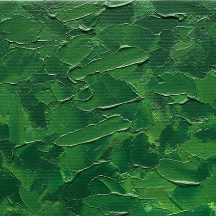


Pieces shown above
The pieces in this guide
Every piece this guide shows, printed to order on museum-quality canvas.


Keep reading
Read next
Guides that pick up where this one stops.