

FRIDAY SALE! • EXTRA 10% OFF + FREE SHIPPING DEAL | CODE: FRIDAY10
FRIDAY SALE! • EXTRA 10% OFF + FREE SHIPPING DEAL | CODE: FRIDAY10

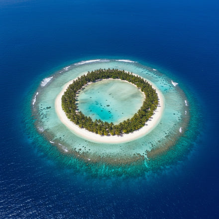
Island wall art depends almost entirely on where the camera is. From the water an island is a shape on a horizon. From above it is a form surrounded by color. Roughly one in ten of these pieces is an aerial, and those are the ones that actually read as islands.
Everything else about the subject follows from that choice, including what size and shape the canvas should be.

Seen from the water, an island is just a hill with sea in front of it, and the eye cannot tell whether the land continues behind. Seen from above, the whole thing resolves: the outline, the reef, the shallow water grading out to deep.
That is why aerial photography dominates the strongest work in this subject. It is also the version that produces the color people want, because the gradient from pale turquoise over sand to dark blue over depth only exists when you are looking down. Island Wall Art is the range.

About one in eight of these pieces is explicitly tropical: palms, white sand, turquoise shallows. It is what the word suggests and it is the largest single group.
The alternative is the cold island, which is a different piece entirely. Limestone karsts rising out of gray green water, rocky Atlantic outcrops, sea stacks under weather. Same landform, opposite mood, and the cold version suits a room that would find the tropical version too cheerful. Beach Wall Art and Tropical Wall Art hold the warm end.

This is the practical thing that separates island artwork from other landscape. In most of these images the land occupies a third or less, and the rest is water and sky.
So you are mostly buying a color field with a subject in it, and the color of that water decides whether the piece works in your room. Turquoise and pale green go into a warm or neutral scheme easily; steel gray and deep navy need a room that can take a cool piece. Judge the water first and the island second. The teal guide covers reading water color.

An island photograph has no built in reference for size. A rock in the sea and a large island can look identical, which flattens the drama that made the place worth photographing.
The pieces that solve it include something with a known size: a boat, a building, a jetty, a person on the sand. If a piece feels underwhelming despite a beautiful subject, a missing scale reference is usually the reason. This is the same problem mountain photography has and the same fix works.

Island work is calm, wide and low in detail, which makes it bedroom and bathroom material more than living room material. It gives the eye somewhere to rest rather than something to examine.
In a living room it works when it is large enough to be the whole event on that wall, and poorly when it is one medium piece among others, because it lacks the detail to hold its own in a group. The bedroom guide covers the restful case, and the spa guide covers why still water calms a room.
A horizon runs across the frame, so the wider the piece the more the composition reads correctly. This is one of the strongest cases in the whole catalog for panoramic, which covers 36 x 12 to 73 x 24 inches and matches what the eye actually sees looking out to sea.
Horizontal work runs 1 Piece, 3 Horizontal, 4 Pop, 5 Star and 5 Pop from 24 x 16 to 82 x 42 inches. Multi panel suits this subject well, since open water has almost no detail for the seams to interrupt. The exception is an aerial of a single small island, where a seam through the land cuts the only subject in the frame. Size to about two thirds the furniture width, centered 57 to 60 inches from the floor.
Quick answers
Because they resolve the shape. From the water an island is just a hill with sea in front of it and you cannot tell where the land ends. From above you see the outline, the reef and the gradient from pale shallows to deep blue, which is also where the color people want comes from.
No, though tropical is the largest group at roughly one in eight. The alternative is the cold island: limestone karsts in gray green water, rocky Atlantic outcrops, sea stacks under weather. Same landform, opposite mood, and it suits a room that would find the tropical version too cheerful.
The water, because it is usually more than half the frame. Turquoise and pale green sit easily in a warm or neutral scheme. Steel gray and deep navy need a room that can take a cool piece. The island itself is the second decision, not the first.
Usually a missing scale reference. An island photograph has no built in indication of size, so a rock and a large island can look identical. Pieces that include a boat, a jetty, a building or a person on the sand keep the drama that made the place worth photographing.
Wide. A horizon runs across the frame, so panoramic at 36 x 12 to 73 x 24 inches matches what the eye sees looking out to sea. Multi panel works well too, since open water has little detail for the seams to interrupt, except on an aerial of one small island where a seam cuts the subject.
Shop this guide
Every collection this guide mentions. Each one opens on artwork printed to order on museum-quality canvas.
Pieces shown above
Every piece this guide shows, printed to order on museum-quality canvas.
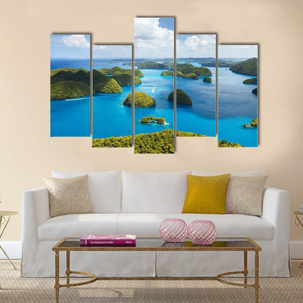 Tropical Island Aerial View Canvas Wall ArtFrom $69.95
 Limestone Karst Islands Over Turquoise Water Canvas Wall ArtFrom $69.95
 Bay of San Sebastian Coastal Cityscape Panoramic Canvas Wall ArtFrom $98.95
 Airplane Landing on Island Canvas Wall ArtFrom $69.95
 Cadlao Island El Nido Seascape Canvas Wall ArtFrom $69.95
Keep reading
Guides that pick up where this one stops.